
Digital Painting Tutorial: The Making of Iconoclast
Anthony Galatis is a freelance concept artist/illustrator based in Athens, Greece. He is a passionate creature and robot designer, he loves horror movies, books, pixel art and retro-gaming. Currently, he creates world sets, visual development and covers for the game and comic industry.
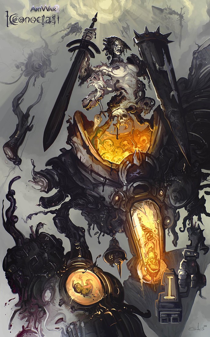
Here, he takes us through his creation of 'Iconoclast' a 2D finalist in Art War 2.
RESIST THE LIGHT
Hi my name is Anthony, I’m a freelance concept artist.
Usually I love to create monsters and creepy creatures. I’m also a big horror movie maniac so I’ve chosen the dark side feeling no remorse at all :)
SETTING UP MY WORLD
It's all about storytelling, create small world sets and short stories about my characters before I even start to paint them, helps me to know them better and become more comfortable with them.
This kick-starts my creative process in the right direction and keeps me consistent.
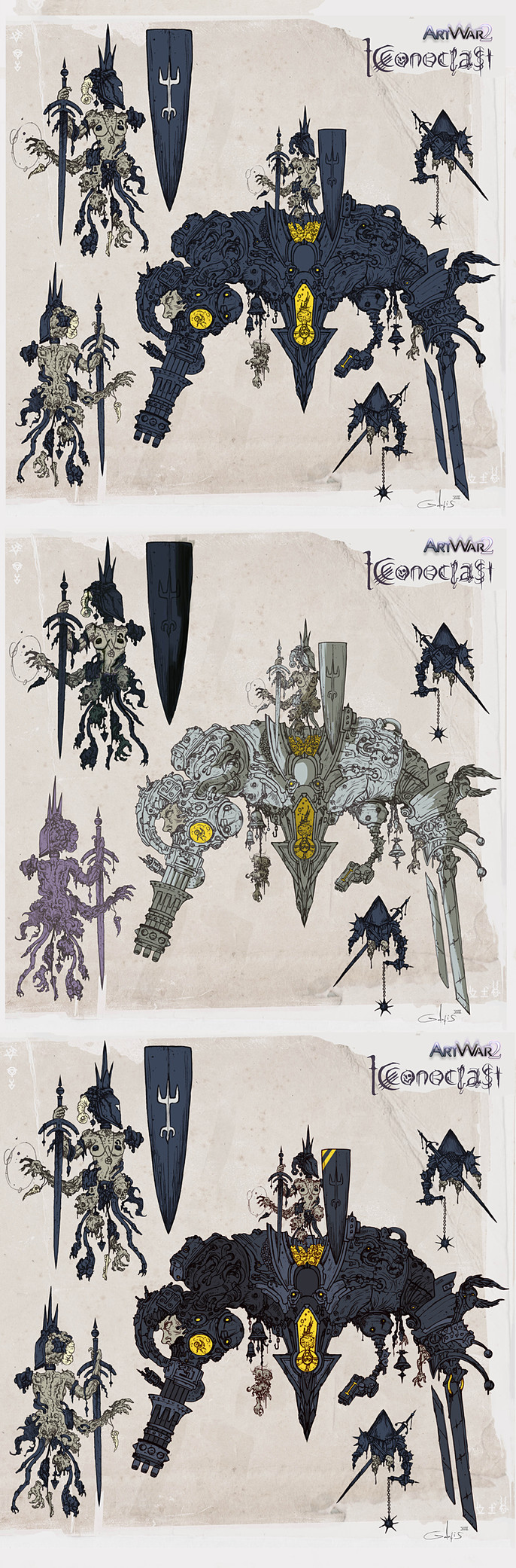
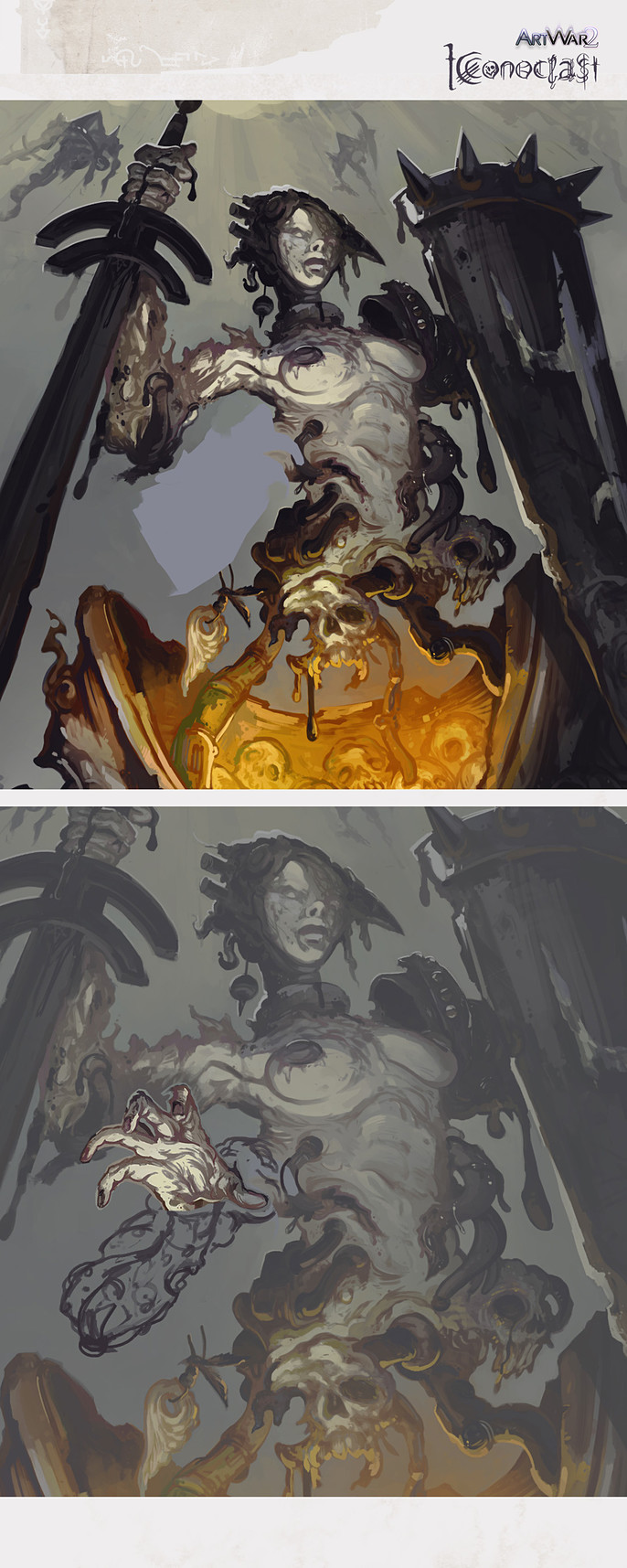
ICONOCLAST
I love to mix mechs and medieval elements so here we go...
My character is a malevolent necromancer spectre “necroqueen” She is attached with a mecha bodysuit “Iconoclast” using dark arts and advance technology. The suit helps her to gain a solid form and be consistent with our material dimension.
GAZING CLOUDS
To be a concept artist is truly a state of mind, you have to generate quick ideas, try to discover new visual aesthetics, breaking your habits and stay fresh. Rendering skills are important too but they come second in my opinion.
One way to stay fresh and create unique designs is first to play with happy accidents and random shapes, then try to carve out forms and characters by looking at these shapes.
I remember my younger self, spending hours daydreaming, gazing clouds with interesting shapes, or strange stumps and transform them into characters creatures, even entire cities.
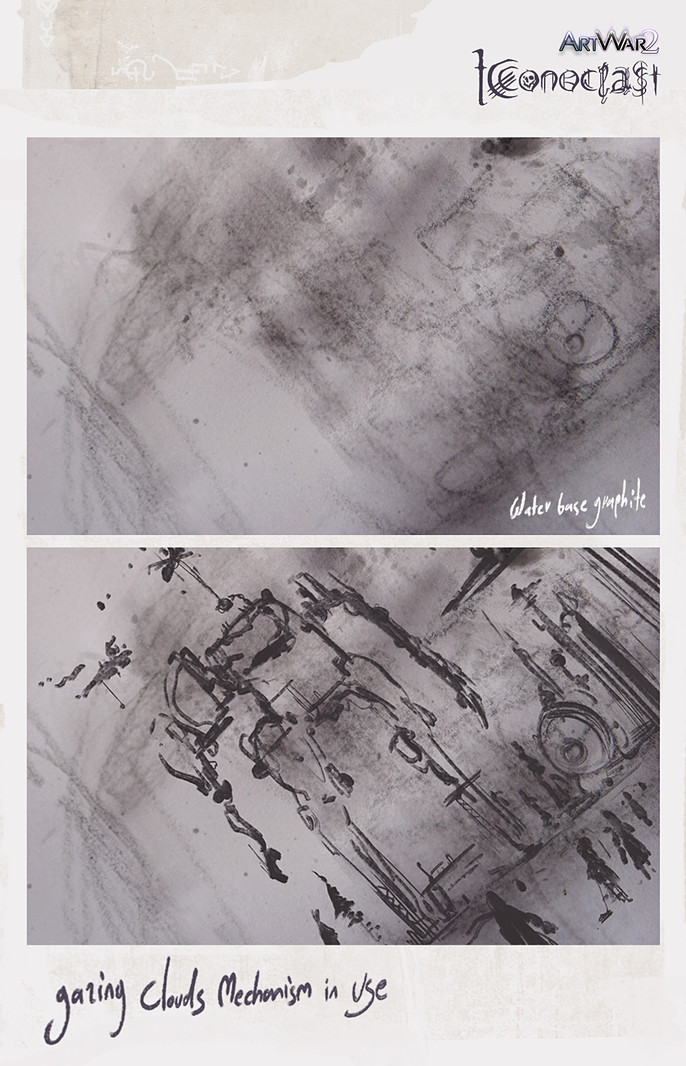
This mechanism comes back from when we were kids, it's within the human nature I believe a lot of people still do this, it's a very powerful tool for ideation if you consider it.
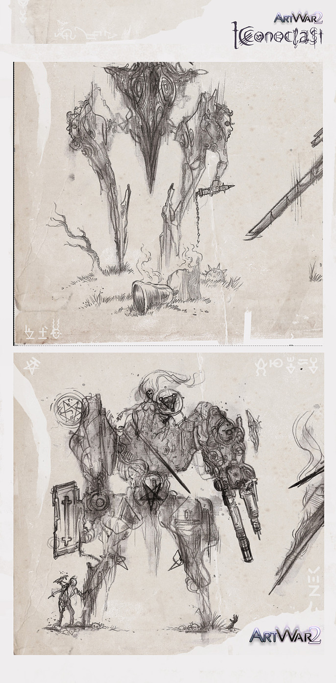
IDEATION PROCESS
Part a
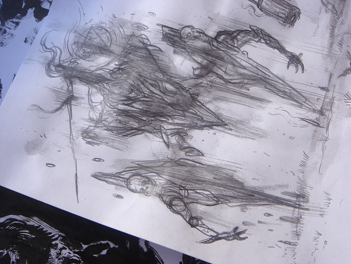
To push furthermore my ideation process I’ll use the “gazing clouds” mechanism, but first, we need to create some randomness. I’ll start my process using traditional mediums, you can achieve extremely random stuff especially if you let water get involved.
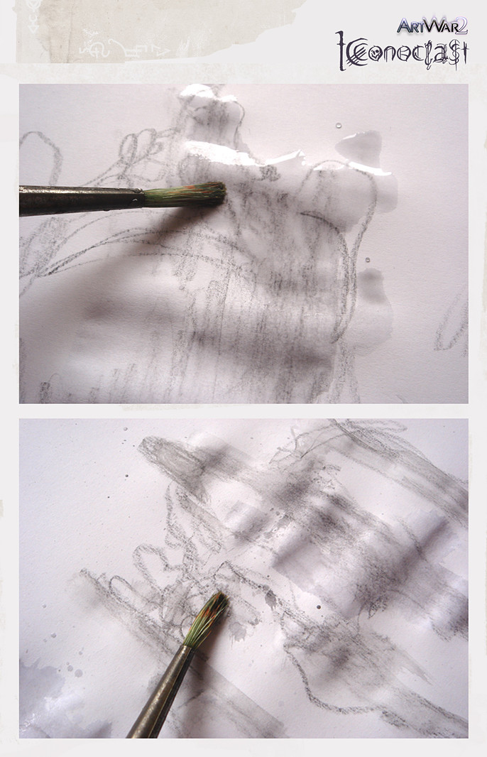
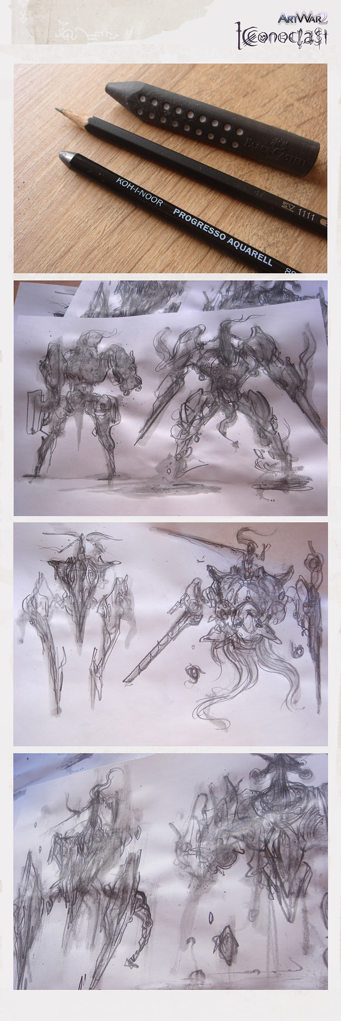
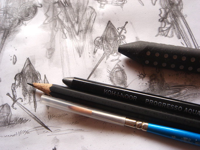
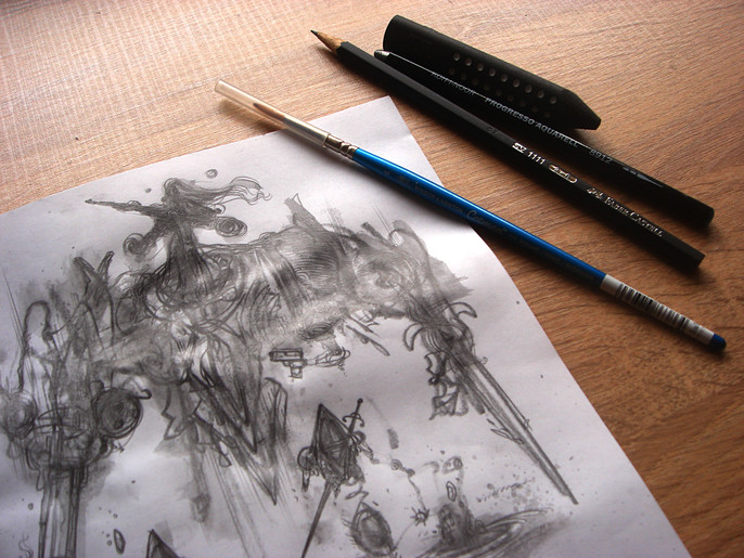
I’m using a watercolor based Graphite (KOH-I-NOOR Progresso Aquarell 8912) and start to sketch very loose shapes and forms.
I add water with a medium size fine paintbrush and try to create more spontaneous shapes with my brush strokes, adding water changes the medium as it behaves now like an aquarelle.
My focus is to create as many as I can, without giving in to the detail temptation.
IDEATION PROCESS
Part b
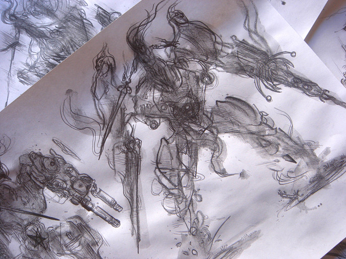
I ended up with a lot of happy accidents and abstract shapes to play with, I could never come up with those without using the random factor, they are pure gold.
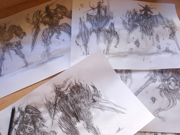
It’s time for the “cloud gazing” mechanism to take control.
I start to carve out my characters, refining shapes into silhouettes using the graphite dry and a 2b sharpened pencil.
THE CHARACTER SHEET
Now I can proceed to the next step and enrich my concepts but before I do, I quickly set up the proper mood for my character sheet.
I’ve used some old texture papers I've gathered on my computer and mixed them with some real scanned paper textures I collect currently, to set up a dark medieval texture base for my characters.
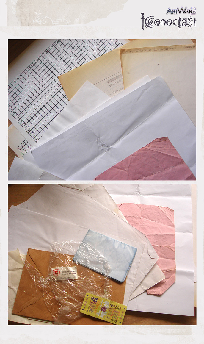
I also create some initials and magic seals to enrich the mood since my hero is a female necromancer.
I don't let anything in luck, every element placed in my sheet must be consistent and contribute to the overall mood I try to achieve.
FRESH EYES
It's my time to pay a tribute and say a big thank you! To all people involved in Art War 2.
Also to thank the Cubebrush team and Marc, for giving me the opportunity to share my creative process of “Iconoclast”
I’m feeling so lucky and proud to be part of such a sharing and growing art community, which constantly expands and helps artists to learn, grow and meet their personal goals.
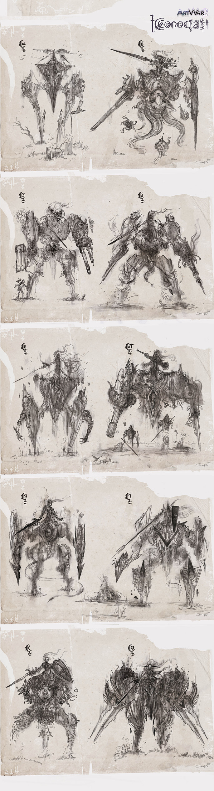
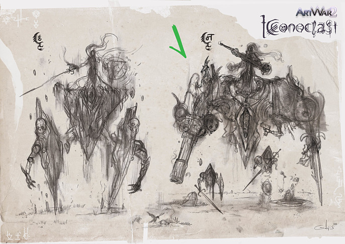
I show the concepts to some friends - family and gather more fresh eye opinions.
The Cubebrush community was very helpful I want to thank all who commented and share their thoughts with me during the process and especially a fellow art warrior “innocent” who helped me also to choose among the options.
GETTING TECHNICAL
I treat my character sheet as a task in a real production pipeline, try to keep things simple and organized.
I take my time to refine the scanned sketch end evolve more ideas, in a new layer on top.
After completing my new loose line work, I lock transparent pixels and fill my layer with a bluish color, to have a light blue version of my work.
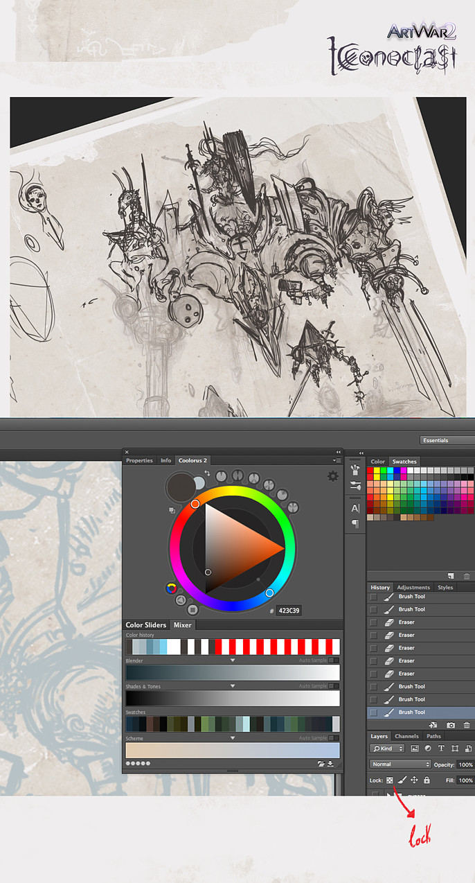
Tip:
By locking transparent pixels you can only affect all the painted pixels on your canvas. You can find the button on the layer window / lock / lock transparent pixels.
I clean up my loose blue line work on top of a new layer.
While working on my final clean up, I exclude from the refining process the goat shoulder design. It wasn't working with the characters overall shape, it also drew some unwanted attention.
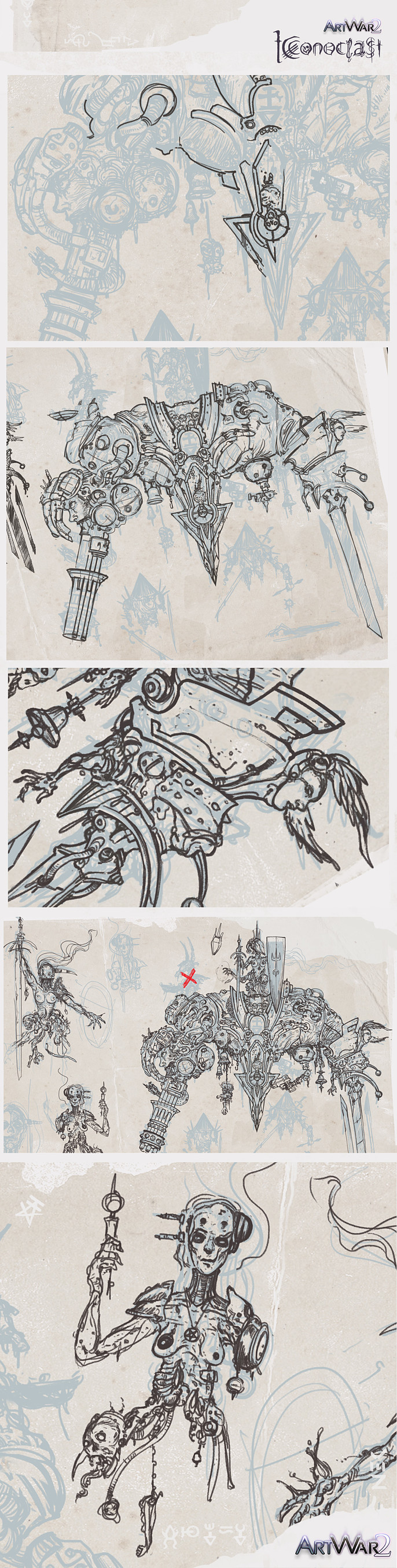
Next step is to fill the silhouette of my character with a random, easy to see color “purple” on a new layer created below my linework.
I’ll use this as a clipping mask for all the rest layers I’ll create above.
Tip:
The Clipping mask allows me to speed up the painting process and paint careless my character in all layers above, without wondering getting out of my line work, the crucial work is done once when I painted my purple base layer.
The line work and glow effect layers are excluded from clipping mask.
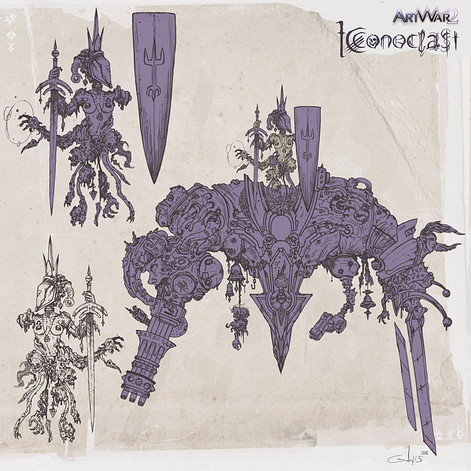
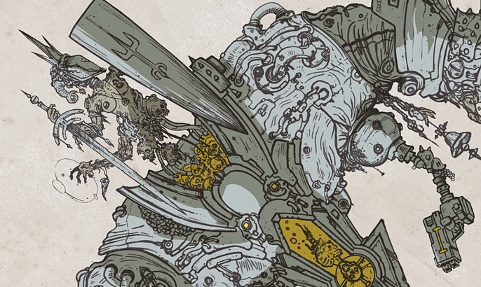
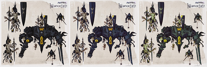
To balance my heavy detailed line work, I’ll use a limited color palette and a cel-shaded kind of art approach.
From early ideation I’ve decided my hero is going to be a black mecha, I use yellow to indicate all its power sources and 3 dark gray hues to add variety for rest of the suit.
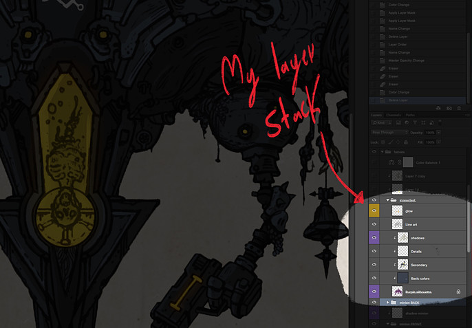
I ended up having seven layers for my character.
Here’s the order from top to bottom.
- Glow effects, Soft light mode
- Line work layer, set on multiply and low the opacity to blent more in.
- Shadows, I set this one on multiply and adjust the opacity.
- Details
- Secondary
- Basic colors
- Purple silhouette (my clipping mask base)
I follow the same process for all my character viewpoints.
I quickly create variant hues, it's really easy since all layers kept separated and organized.
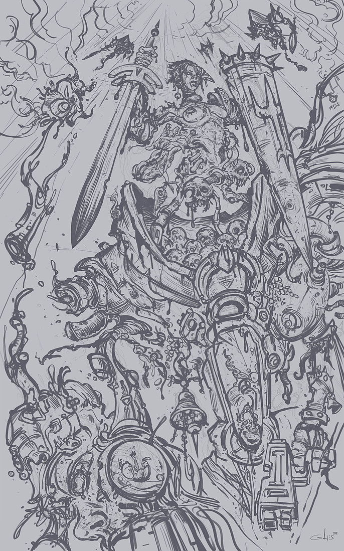
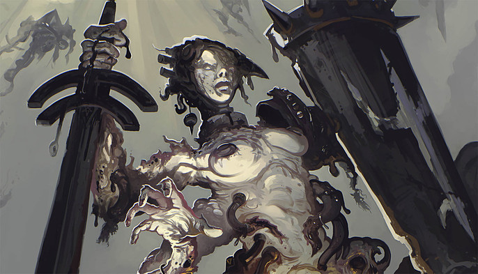
STAGING THE MAIN IMAGE
My hero is an evil spectre attached in a really huge floating mech, I had to figure out how I’ll stage my bulky champion without losing the focus from necroqueen and create at the same time an interesting and dynamic piece.
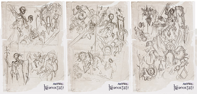
A slight low angle and a portrait canvas will do the job for a start, I sketch on paper some rough concepts, trying different layouts.
The thought to depict my champion victorious but severely damaged after giving a fight with the other side was really tempting.
Even huge evil mechas are vulnerable, I guess.
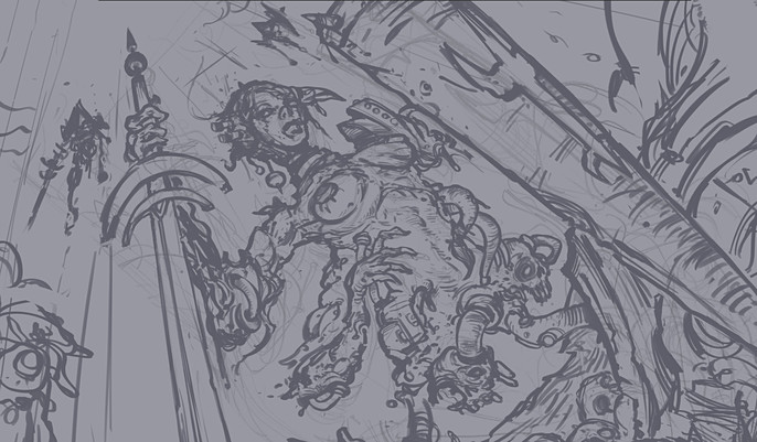
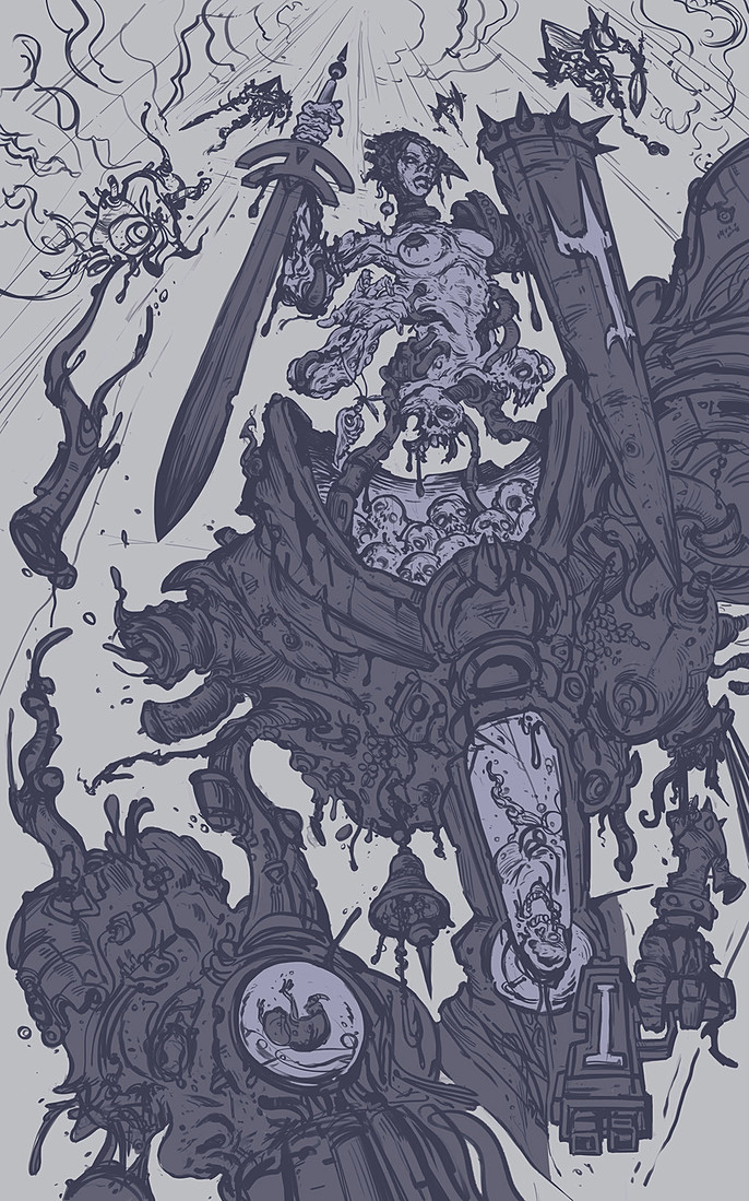
LINEWORK
I scan my concepts and use the same workflow with the character sheet creation.
I don't like to work on an empty white canvas, so I filed it with a grey tone and set my scanned pencils on multiply mode Plus, it gives me a great base to build on my values later.
I remove the helmet from the Necroqueens head so we can see her face and create my initial focal point.
Tip:
Flip the canvas horizontal.
I often flip horizontal my canvas to give me a fresh eye while working. It is really helpful and keeps your design balanced It can also reveal a lot of hidden mistakes and misconfigurations.
You can flip your canvas going to Image / image rotation / flip canvas horizontal, adding this command on your shortcuts will become very handy and timesaving.
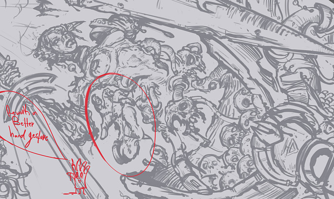
I take a short daybreak and come back into my piece with fresh eyes.
My characters second right hand gesture was bugging me so I decided to give my Necroqueen a proper hand gesture.
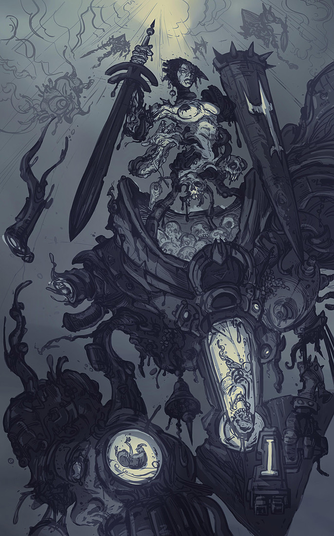
ESTABLISH MY VALUES
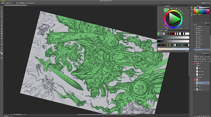
The line work Is done, time to prepare my image for values. I fill my champions silhouette with a green base color to use it as a clipping mask and build upon it my base value tones.
I choose a soft value tone for all floating parts in the sky then apply it to the minions. I plan to push them back into the atmosphere and give more space for my mech to breathe.
After establishing all the basic values solid (without light information) I create a new layer, set it on multiply and try to paint a dramatic lighting for my champion.
ADDING COLORS (underpaint)
Early consideration:
My plan is to paint an apocalyptic desaturated scene, a stormy sky with light rays coming through a cloudy epicenter leading down to the character, I try to impute an ascension mood in the piece.
I use the powerful Gradient map layer style to colorize my grey values. I choose only two basic hues for my gradient.
Blue greenish tones for dark values and yellow for the light.
I set the layer mode to color and lower the opacity into 70%.
I spray on some new layers above warm yellow and orange color tones, I set the layer modes to overlay and soft light.
I repit for all my secondary focal points, the energy skulls, the skeleton and the demon infrant inside the right hand minigun / head, dome.
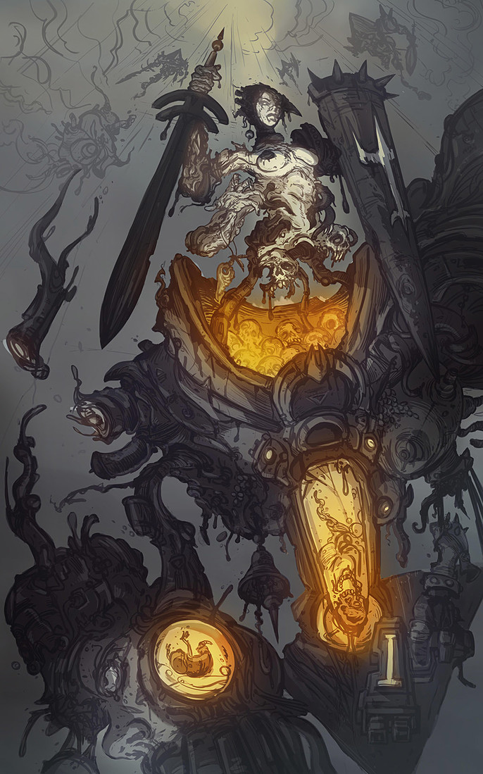
At last I adjust the opacity were it looks not oversaturated and color balance my entire image into more reddish tones.
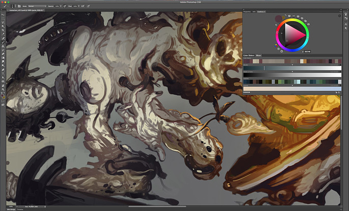
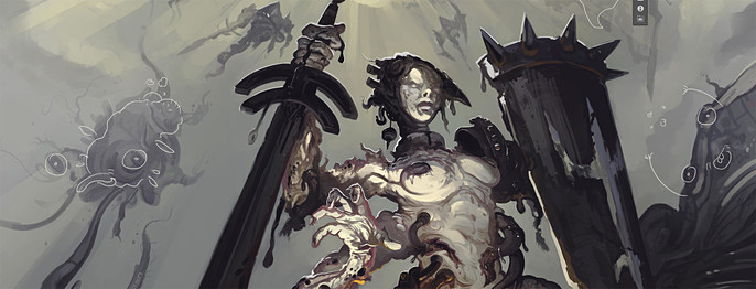
PAINTING TIME
It's time for some actual painting! I merge my layer stack into one and start painting using a simple square texture brush (90% of my paint work is done with it).
I’m using also a default round airbrush for blending, glowing and to create some atmosphere (depth of field) effects.
I want my image to have a painterly look, so I reduce the use of layer modes to minimum and try to paint shadows and highlights in normal mode, select the right hues and values as if I worked with traditional mediums.
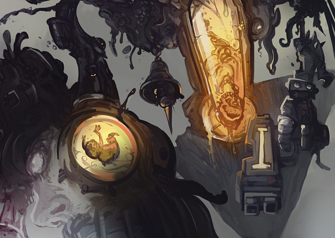
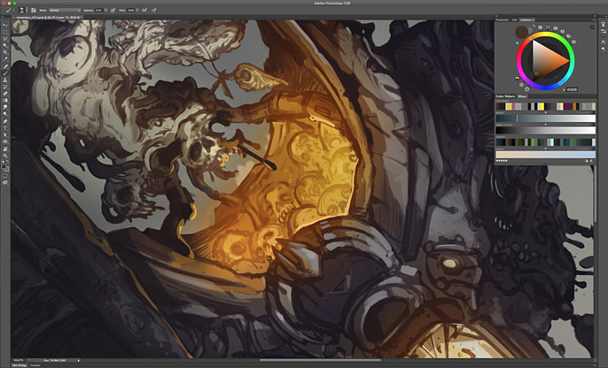
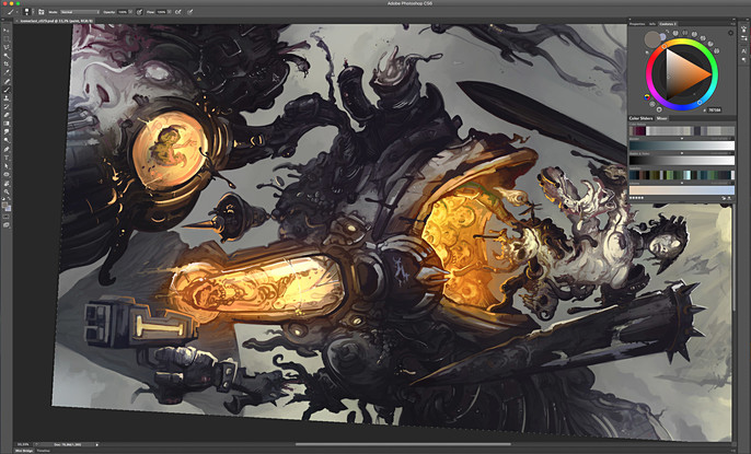
BRANDING THE MECH
I am pretty happy with how rendering looks so far.
Mech body parts and materials are distinct enough so is time to give them more identity by naming some parts and branding the manufacturer company, behind the iconoclast mech series.
This adds more story into the piece and place my champion into a believable world set.
This part is quite fun.
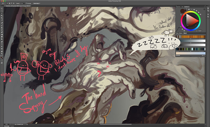
PHOTOSHOP HAND SURGERY
Seen my image with fresh eyes after a daybreak working on Art War 2 project, made me realize that attaching the dismembered left hand at the right side of Necroqueens torso didn’t looks so nice, I decided to arrange a photoshop hand surgery :) and give her a pair of “right ones”.
DETAILS VS SHAPES
For the sake of a neat visual shape language and to achieve a nice read from distance, I zoom out and sacrifice a lot of my rendering and linework detail, by brushing some large shadow areas on my character.
I reduce the contrast and values were is necessary and blend some more parts with the atmosphere.
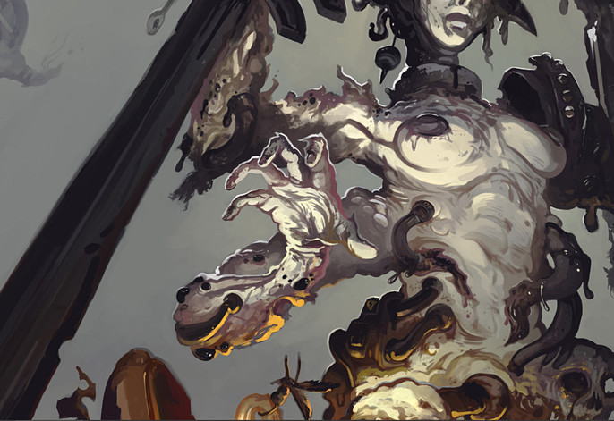
DAMAGE CASE
Near my focal points, I zoom in and give some extra weathering, add textures and small pipes with fluid leaks, refine here and there some more.
FINAL TOUCHES
The image is almost done, time to add the final touches. I merge down all layers into one, make a copy and apply a high pass filter on it.
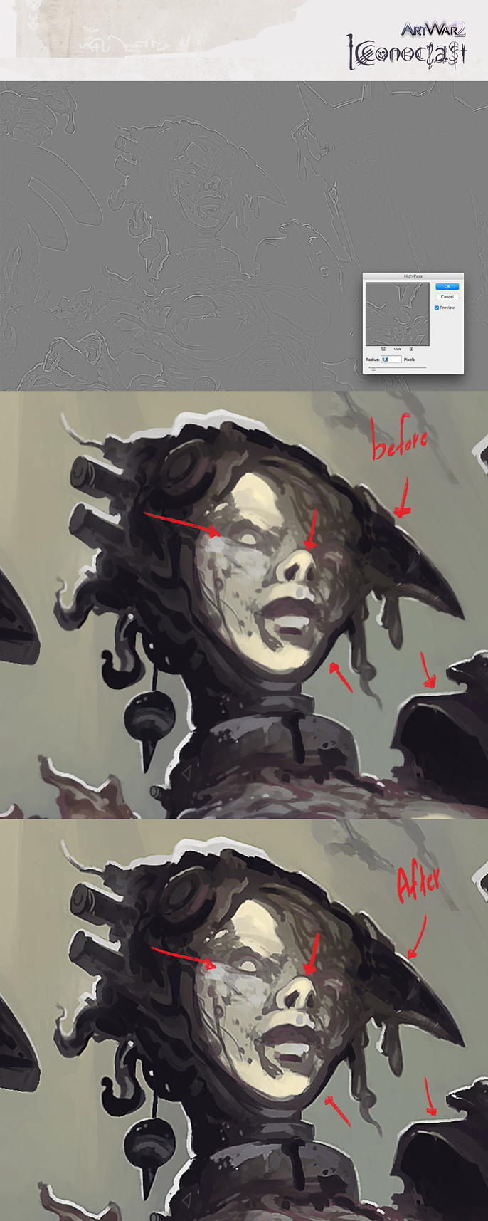
Tip:
High pass filter- You can find it under Filters / Other / High pass.
I set the radius at 1,6 pixels. This is going to give me a cool sharpness effect and enforce all the detail work.
I found out that small amounts work better when applying a high pass into my work so I set this layer to overlay.
I merge down one again and apply a chromatic aberration using the Lens correction filter and call it finally done.
Darkness will rise soon…
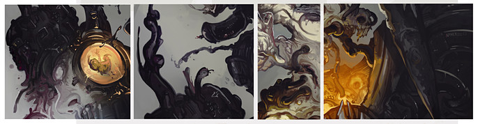
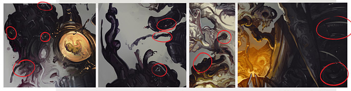
DAYDREAMING
Here’s a fun fact about this piece- Looking my image with friends and fresh eyes we discovered some creatures which live inside my image using the “gazing clouds” mechanism for once more.
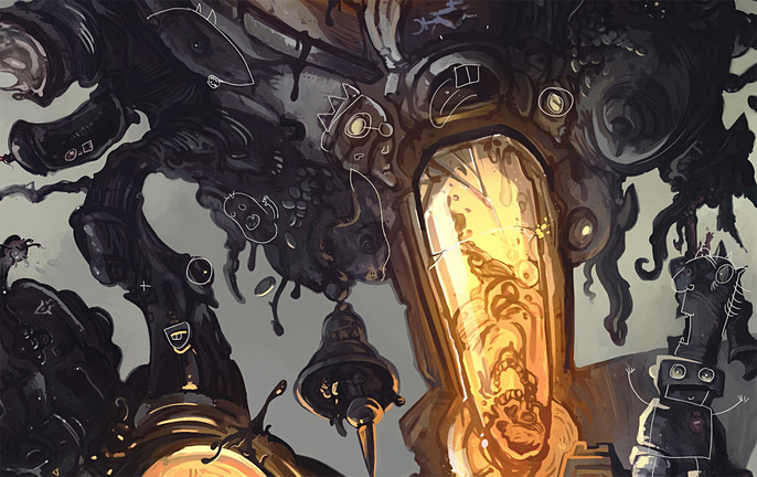
I also create a variant giving my Necroqueen a cracked face bleeding black blood.
I had a really good time making this one. I hope you enjoyed my process.
Good luck to all art warriors!
See Anthony's work here.