Buck "Whistler" Smith
My name is Roberto Bianchi and I am a Concept Designer and Illustrator based in Milan, Italy. I mostly do freelance work for companies creating concept designs or 2D art assets like covers or other marketing material. This contest was a blast and for events like this, I suggest participating when you have the chance, no matter the level you’re at. It will always teach or hone some skill in your arsenal. Here is the making of Buck "Whistler" Smith.
Starting Up
Before even holding a pencil I read the briefing carefully and let my mind wander in search of cool ideas. When little bits are coming afloat I start to gather references to fuel this process even more.
Sometimes it is helpful to let the thoughts rest for a while (like a day or two), the stronger ideas will still be around while the weaker ones will dissolve naturally.
After having brainstormed a plethora of possibilities it’s time to cut some twigs and narrow down the concept to isolate your route till the required amount of subjects is reached.
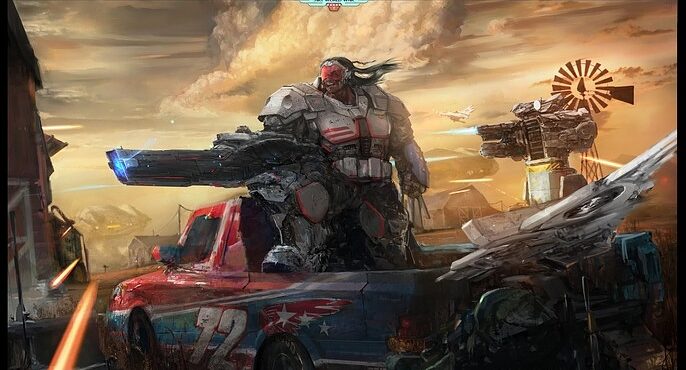
In my case, I ended up choosing the United States of America. I wanted a famous subject so that people could relate to it in a way, but the challenge here was to create something avoiding clichès as much as possible. To do so, you often have to search in weird places; I found native cultures to be a vivid source of inspiration that more often than not may surprise me with interesting stuff.
As I decided on the destination, the next step was dressing up with equipment for the trip. I’m talking about the look and the main role of the character.
I went for a super tech soldier from the special forces, a sort of green beret: fighter and at the same time inventor, someone who develops his own weapons. One of my main references were the characters of MGS like Solid Snake or some of the villains.

Pick and Choose
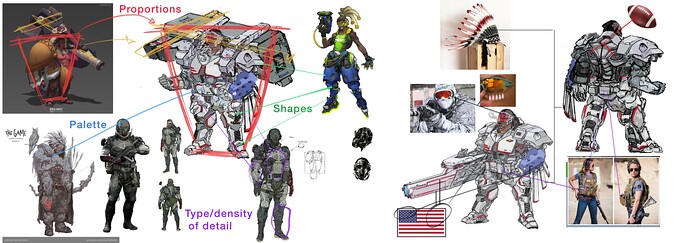
As my concept evolved, I gathered a line of references that would aid me where needed. Rather than discovering new shapes, colors, or substances, the bulk of our job I believe is in recombining and rearranging elements and proportions that already exist in other things.
For example, I studied some successful characters designed by other top-level artists and tried to take and incorporate what I liked from them. This step was also done by extensively researching military equipment. What kind of suits wear next-gen soldiers? What tools do they use? How can I show or include mechanical gear? What purpose should it have?
In parallel with this, I had to do a similar thing introducing elements that would be clearly connected to the brief’s request: the Nation’s identity.
Before using the found materials the core concept of my nation had to be broken down into pieces. So, I recalled all the elements that spoke back resonating with the idea, like the Bald Eagle, Nascar cars, Football, Patriotism, and the idea of Freedom.
You’ll notice that to fulfill the latter part the U.S. flag was disassembled adding a striped pattern to the weapon and the armored suit, Football shapes were added to the back and an eagle’s feather is interpreted as a mechanic element that recurs under the arm, on the headpiece, and in the drone wings.
Planning the Stage
Now I needed a place where the character could come to life and be ready for action.
After various steps of thumbnails, I ended up with this sketch. Some of my early considerations were to add recognizable monuments or landscapes since I decided to depict the subject defending his homeland, but in the end such bigger elements were sacrificed in favor of showing enemy walkers attacking the country, to better underline the dynamics of the battle.
At this stage the BW sketch had most of the elements sorted out. After some resizing and moving the composition was arranged to make sure all his components contributed to an eye path and gave a clear hierarchy of importance.

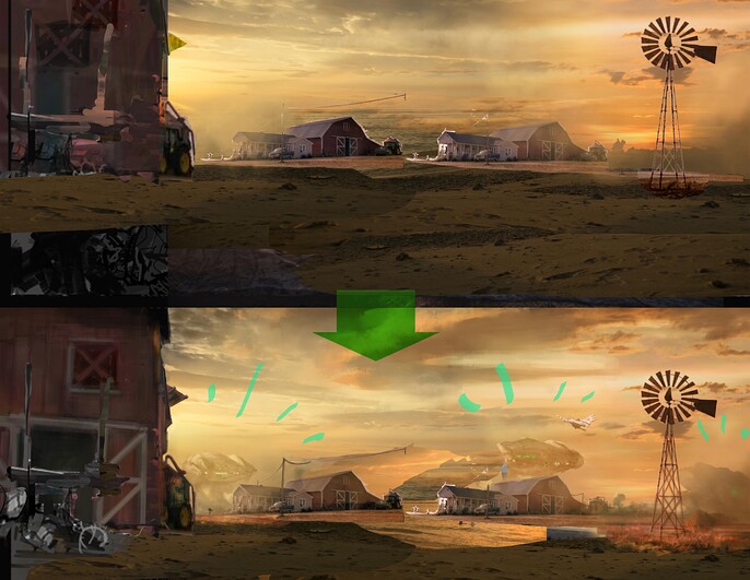
Prepping the BKG
Here things begin to be fleshed out more and more. Separating each depth level and starting to paint over it. Often I use techniques like photobash or 3d mockups to accelerate the build-up of the underpainting. 3D models and grids are also very useful to make sure your perspective isn’t off.
When compositing images a handy tool, I frequently try (if you’re using Photoshop) to match the color (under image, adjustments). It doesn’t always work but oftentimes it does the heavy lifting for you, making an image look closer to the same setting.

Adding to the Layout
Now that the sky is done it is time to keep refining to the other layers in the depth starting from the horizon line all the way down to the midground. I try to group elements based on their overlaps so that I can easily shift or move them without compromising too much the rest of the picture.
At this stage, I should mention that I had a plan for the color scheme of all the images: since the character and his car are mainly in white, blue, and red, I went for a golden yellow that embraces them– giving a sort of aura of glory to the scene.
Another consideration that I will keep in mind as I advance with the rendering of the foreground elements is trying to give the biggest difference in values on the main subject and elements that are closer to us. This helps limit the contrasts to the areas that should have a primary interest for the viewer.
Rendering the Mid
For each item, I usually start with a BW value sketch. If the sketch hasn’t got lineart this is the point I do it. If things aren’t well sorted out in my mind or if I want to give the client some clarity to avoid surprises later on. In this case, I went straight from gray color blocking to rendering as I had more freedom. Then put some color in overlay mode and after I established the main volumes and light direction start the rendering phase with color picker and brush. In this process, I keep going forward and backward trying to correct and polish everything that’s off as much as I progress the painting giving more attention to areas that should be in focus.
If you’re stuck with some complex element that you have a hard time figuring out how behaves in the space of your shot, you can take a snapshot from Sketchfab of an element that is the closest to what you need. This way you crafted a reliable reference rather than spending countless hours searching for a specific photo from a specific angle that most of the times will still have some perspective or lens issues.

As I went on, I decided to make the character pop out more adding a cloud behind him. This also adds epicness to the whole shot, so I searched for a bunch of cool paintings from Mark Maggiori and eviscerated how a cloud formation is done. Remember always what kind of reference you are looking for as an illustrator will make choices altering the reality to convey his message in the best way possible, while a photo is a mere flatten and color clamp.

Post Process
Everything is almost finished, the cherry on the top is one of the most dangerous stages of the process as it can easily get out of hand making an unnecessary mess: yes, I’m talking about the glows.
The final touches are to sparingly add dust, projectiles, light fx, debris, and all the tiny bits that could make our frame look like it is a snapshot from our world rather than a premeditated artifice where you tell the characters to pose in stiff positions for hours. Elements like the wind are deducted from the viewer from a number of circumstances rather than by just gray whooshy lines.
In the very final touch, I find a crossroad in my way of working: if I decide from the beginning to go with a strongly dynamic composition I rotate the canvas to work perpendicular and with more ease till the end, where I incline the frame back to what was intended, otherwise, I test if tilting the composition could add or subtract some weight to the final result giving a more precarious or balanced feeling. After that, I do a flow check, some vignetting and the job is done.


I hope you enjoyed my process and found it useful thanks for stopping by!

Follow Roberto here.