
Concept Art in 10 Minutes
Grigory Lebidko teaches us how to create concept art in 10 minutes.
Lebidko was the Lead Character Concept artist at Allods Team (working on "Skyforge" MMO) until moving into a freelance concept artist role in 2016. He's currently the Character Concept Art Instructor at Scream School and Smirnovschool. Here he shows us how cut down concept art to just 10 minutes.
In most human endeavors there's practical skills and there's theoretical knowledge behind those practical skills. Some practical skills have to be honed for years regardless of how well versed you may be in the theoretical aspects of whatever it is you're trying to excel at. This happens because simply understanding how to do something is not enough; you have to develop the motor skills to control your body in just the right way. Or you may need to develop an arsenal of tried and true methods for how to accomplish every specific task that your job might involve. Anyone can open a guitar chords chart and play a simple tune by slowly moving the fingers across the strings on the guitar, but you need to have had heaps of practice before you can play a tune effortlessly without constantly looking at the chords.
There is also theoretical knowledge about what to do to get the result you want. For example, you can read about how to do a heart transplant. You need to have a very clear understanding of what needs to be done before, during and after the surgery to ensure it goes without a hitch and is successful. The same sort of thing happens when we start talking about creating concept design. You have to have the skills of an artist in order to be able to implement your concept design. In addition, you have to understand the rules your concept design relies on.

So- where does all this information come from and how did this lecture come about in the first place? One reason is naturally laziness. And you shouldn't be surprised.
Laziness is actually a huge driver of progress.
I would like to have a check list of what I need to do when I sit down to work on a new concept design so I can spend more time on the practical aspects of the design. I've been teaching concept art for 5 years so for me the question also is how to make the teaching process more effective and more pleasant. The more experience they gain in the process the more in demand they are going to be and so will I as an instructor. It's a win-win situation. The fewer problems my students run into with the basics the less time is going to be spent on it in the feedback phase.
This tutorial is a very abbreviated format. I think it will be interesting if we immediately try to see how these principles are implemented in the design of the characters of modern game-bestsellers.
Global Overarching Goals of Concept Art
1. To visualize an idea, whether it's something that the script writer or game designer came up with or something that you thought of and you want to visualize it in such a way as to get the viewer to feel the emotions and feelings that you wanted to put in your design.
2. To do it in a visually attractive and interesting way.
So how do we go about achieving that? In our time of modern art and post-modern art many people have a firm belief in the subjectivity of art. Since art is subjective they don't think it is at all possible to quantify or analyze it and to differentiate between a good and a bad design. Fortunately, that view is not entirely true. There are various schools and movements each with their own rules. Everything that people create, such as architecture, industrial design, fashion, art, - it is all based on practically the same principles of composition. They all stem from the way our eye perceives reality and how we respond to things that we see. Every good design has some psychology behind it.
This list is an attempt to bring together all of these universal rules and apply them to design.

As we've already seen, a key mission of concept design is to communicate the story or idea behind the character. For instance, say, your task is to draw a good knight. We can break it down into several elements that will help us tell the viewer a story about who it is they are looking at. At this stage it's very important to understand that the only way we can communicate with our audience is through visuals.
Let's try and break down into symbols that can instantly communicate to the viewer that it's a good knight they're looking at.

The first thing that comes to mind is shining armor. Then our knight is going to need the kind of weapons like a sword and a shield, possibly a lance. Then things get interesting. What is it that sets a knight apart from a regular warrior? The status, of course! A heraldic symbol on his shield or armor immediately tells us that this guy is not a regular warrior. What colors are we going to use to tell people this is a good guy? Do we want to paint him black and red? I doubt it. We want lighter colors, white and gold, light blue, possibly a red cloak. All of these are symbols that we got by simply analyzing what the idea of a good knight means to people in general and what symbols we can use to communicate this story.
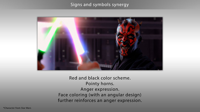
There is an important aspect that has to be mentioned here: it's always a good idea to try and get all your symbols to work in synergy, complimenting the overall image. For example, our champion type would be very well represented by a young man or woman with golden hair and blue eyes. It's your standard stereotype that would be a perfect fit. Keep in mind, we'd want heraldic symbols that are more associated with good rather than evil. Roses and crowns or a friendly looking lion, unicorn or noble deer are all great options. While such symbols as dragons, boars, or aggressive looking lions would be poorer fits for our purposes because they imply aggression.
This is what we refer to as synergy of symbols, in other words, we want our symbols to compliment and amplify our basic message about the character rather than run in the face of it. Can we break these rules? Of course, if you know how they work and know what you're doing! If 9 out of 10 symbols send a loud and clear message, then we can play around with the 10th symbol to serve our interests. In one situation we could put a dragon on the coat of arms, in another situation we can use a different type of weapon or armor. It's important to remember that 9 out of 10 symbols must be serving the main message as otherwise that 10th symbol that is out of kilter can completely distort the character's image, even turn it on its head.

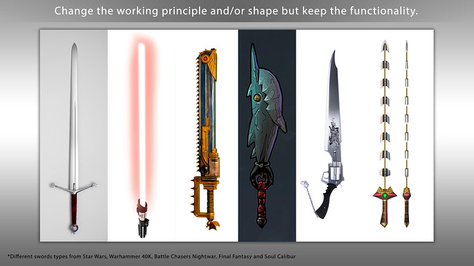
You'll want to explore your task in your design as much as possible. For a number of reasons, it's going to make your design more honest as well as more complex and interesting. What is a knight? Can we get across the idea of a knight out of the context of Western-European knights?

Are the Samurai, the Aztec eagle warriors and Mamelukes also various types of knights? What about a Jedi from Star Wars or a Brotherhood of Steel from Fallout? Suppose you have a simple chest, what is it? Is it just a container for storage that you can put a lock on? If we were to treat our chest in this manner, we could get a lot more variety from it than if we simply treat it as a box or a container. It's important to note that in order to get this to work with the audience they must not have any questions about the function of what they're looking at.

This brings us to the topic of references. References are the foundation of your concept design.
It should be noted that everything we do in design and art boils down to three basic ways of how we can work with information:
- Copy
- Transform
- Combine it
If we don't have any information in our experience we won't be able to draw it let alone transform it into something new. We can only include the look and feel of medieval armor in the design of our knight if we have exhaustive information about what it is supposed to look like. In other words, we need a reference point.
The more information you consume the more varied design you're going to be able to create.
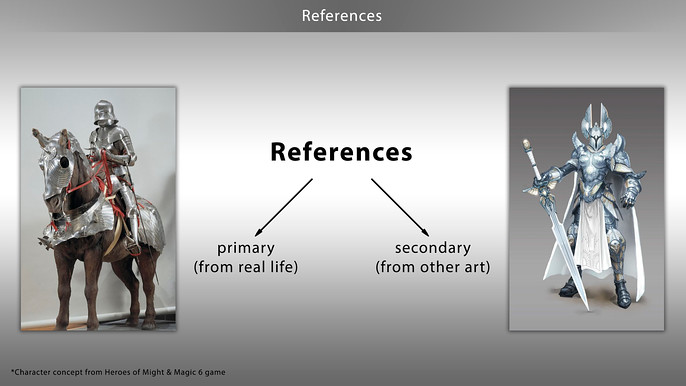
We also need primary and secondary references.
Primary references point to something in real life. For our knight, those would include real life armor that existed at some point in time or perhaps costumes seen in movies. Primary references are used when you want to find maximum functionality and a real life feel.
Secondary references point to other designs, information that has already been processed by another designer. Secondary references showing you how other designers interpret various elements from real life, how they change and expand on them.
If you lack one type of references in your design there is a risk that it's going to be either too realistic or too unreal. This is especially true for the first few years of your work. Without an idea of secondary references you will not be able to assess how your design is relevant for today.
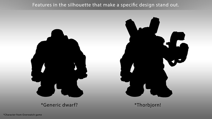
Now we've got our references and we've identified our symbols. What next? Now is the time for creating drafts or looking for your design. You start by trying to get the outline right. The first thing a human sees and remembers is the outline of an object. The right outline is another corner stone in the foundation of a successful design. We're going to rely on the pie principle, as I call it, or the 60-30-10 rule. Whatever you do with your design it must have rhythm and it must be readable. It must not be monotonous.

We perceive the world by comparing and contrasting things. Comparing and contrasting is at the core of our learning process: big vs small, cold vs hot, hard vs soft, good vs evil etc. The same rules apply in design. Aspect ratios and contrasts are what make your design more readable, more interesting and easier to look at and take in.

The outline of your character must be readable; the different elements must not have outlines merging into each other. Ideally, you want to bring as many of the symbols that define your character as possible into the outline.
Volume changing gradients also work well: you go from thicker shapes to narrower shapes and vice versa.
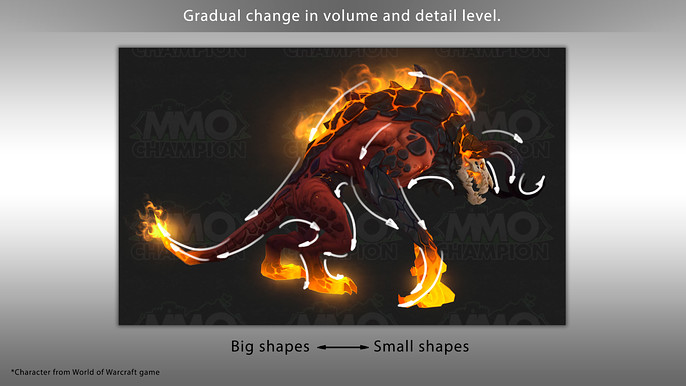
It should be noted that gradients can be used to great effect at different stages as you work on your design. There are gradients of shape, detail or color. They add to the internal complexity and dynamics of your character. They make it more salient. In real life we're surrounded by all kinds of gradients so we might as well use them in our designs.
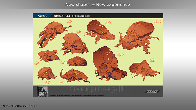
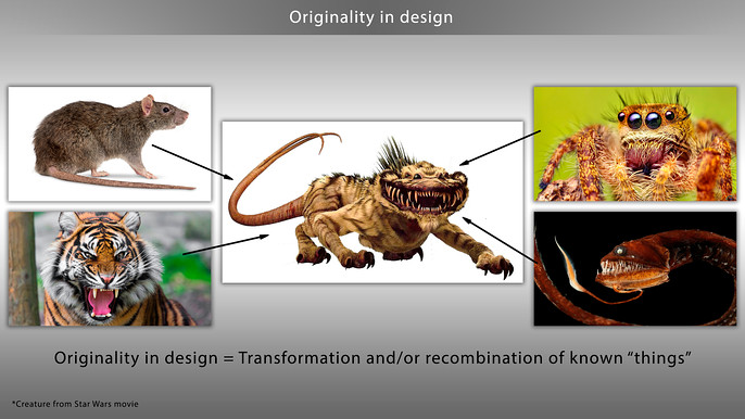
For a lot of modern artists, the secret to their mastery lies in their ability to transform volumes and shapes of familiar objects while keeping the familiar elements or creatures in them that make them recognizable. This makes the design original.
The next stage is fleshing out your design with detail. Once again references come to our rescue, but now we need more detailed reference points.

You should be determining what a specific element is made of in real life, how it works, how it functions, what materials it consists of, what kind of detail it can have, etc. As you're still just looking for your designs you will probably be drawing symbols of things rather than finalized images. In order for this information to be introduced into your design you need to already have it in your head, having seen it somewhere else or you might need to go looking for new references for how the things you want to depict function and how they're put together in real life.
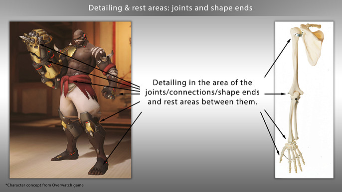
When fleshing out a design with details it makes sense to pay special attention to joints and tips. If we look around us or even at ourselves, we will see additional detail or functionality in the joints between various elements or at their tips. This has to do with the fact that it's usually at their tips that various objects get additional functionality. The tip is the place where the object normally interacts with other objects so there is usually a change in function and new design elements.
Pay special attention to joints between elements- your design will be more realistic and more convincing. The more believable your design is the better. Also remember you want to have both areas with a lot of detail and areas of sparse detail for people to rest their eyes on. This variation can also draw the attention to those elements of your design that are really important and that you want the audience to pay more attention to. One task is to make your concept design look good. The easier it is for people to perceive and process, the better. Heavy and light spots in terms of detail will help with that.
Next we're going to talk about colors and materials. Partially we're guided by the same principles here, including my favorite 60/30/10% principle. Our character must have color accents in the portrait area, in the weapons, and in the areas important for the game-play (for example, the areas of vulnerability or areas where the character interacts with other objects).
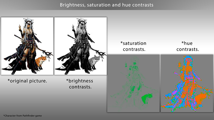
There are three main types of contrast you can use with color:
- Tone contrasts
- Saturation contrasts
- Color contrasts
You can use all of them at the same time. It should be noted that our visual system responds differently to each type of contrast. The tone contrast is perceived as more powerful than the saturation contrast, which in turn is more powerful than the color contrast (everything else being equal). Then there's the contrast in detail (both in terms of the complexity of the outline and in the level of detail). The same principles applies as with symbols in point one. What this means is: you don't need to have all the contrasts at the same time in every significant area such as the portrait area, the weapon or the game-play areas.
But...
The total power of these contrasts must be greater than any others or you will be drawing the player's attention to less important elements and away from the elements they should be concentrating on. Gradients work wonders here. Among the gradients that are used the most often in coloring, the following deserve special attention:
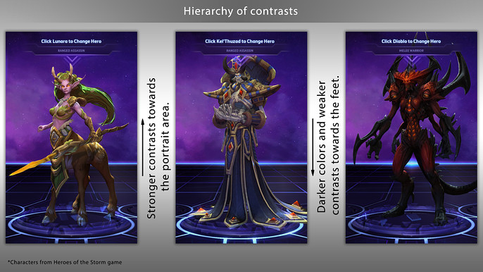
- Darkening and reducing the contrasts towards the bottom of the character. This helps highlight the contrasts in the portrait area and achieve a hierarchy of contrasts.
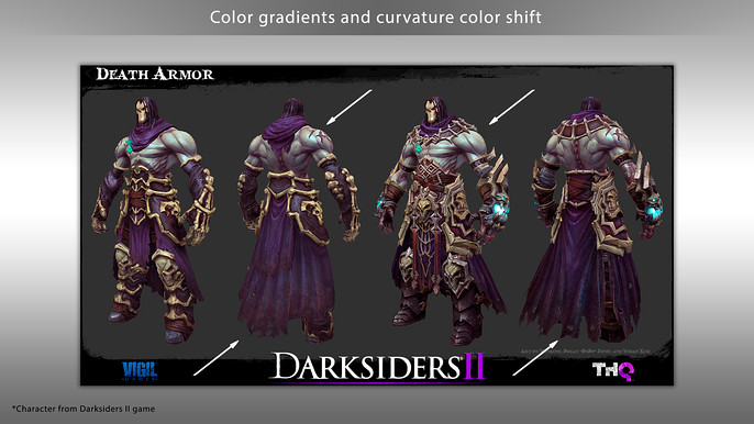
- Changing the color on protrusions and depressions.
- Cold and warm color contrasts in lit areas and in the shadows.
References must be kept in mind at this stage as well. Both for color combinations and for materials. You want to keep track of contrasts between matte and shiny materials.
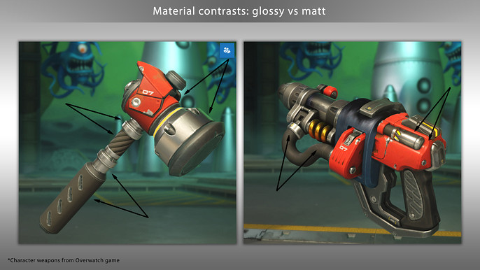
Shiny materials can add accent to detail in your design by amplifying the difference between light and shade on the surfaces.

Internal animations of some elements of a character's design or any other visual effects may draw a viewer's attention.
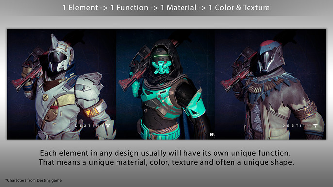
A great rule to be remembered for the future is: a separate element in any design usually will have its own unique material and that means a unique color and often a unique shape. This will allow you to make your design more realistic and convincing while also making it more visually complex.

Keeping references in mind, we need to think about how each material works, what kind of texture it has, how it changes over time, what happens to its looks through wear and tear. This can also add life to your design.
In addition to the principles mentioned above, there are a few more general rules. Harmony is important; lack of harmony will cause your design to fall apart if there is discordance between the different elements. Harmony can be achieved by having a shared element that shows up in various guises in all the other elements of the design and holds them together. The most powerful such shared element would be color.
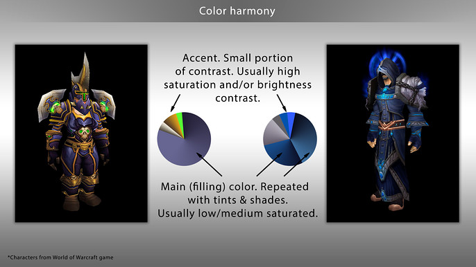
Color can be used to create great color harmony. The second most important element is shape.
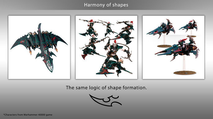
You can use the same types of power lines that are shared by all the various elements to hold the design together.

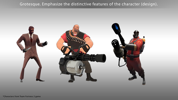
If all these are present in your design you can try adding a little bit, or a lot, of grotesque, you can amplify contrasts, to make the main elements of the design or the character really stand out (once again using contrast or shape and color complexity).
In the meantime, remember that your design must remain easy to understand for your audience at all times. Nobody can read a book in a language they don't understand regardless of how interesting the book may be.

It's the same for concept designs: you want to use symbols and images familiar to your audience. People won't be able to understand and appreciate a design that's too revolutionary. And yet, if your design is made only of tired clichés people may find it boring, like a song or a film that you've already seen a thousand times before.
Try adding something new to your design.
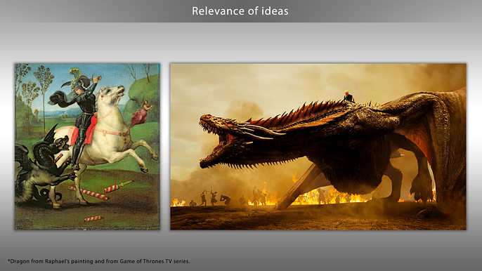
Whether it's a new shape on a familiar item or a new combination of familiar symbols. Here secondary references may come in handy. You want to be aware of how things are done in other sources because your audience is likely to compare your design with them.
Special mention should be made of the psychological aspects. There are no rules for how to create designs but the topic of what you're drawing is important.

This is where our human instinct and the culture we grew up and live in comes into play. Regardless of your personal preferences and tastes you have to be aware of the tastes of your audience and of how people respond to various inputs on the gut level. The same symbols are interpreted different in different cultures and sometimes even in completely opposite ways. This should be borne in mind.

Naturally, try new tools that make your life easier. First try them on a small piece of work and if it saves you time then try new tricks or techniques, especially if they allow you to get the job done in less time.
These can also prompt new solutions in your design. There is a parallel I like to draw - We can't run faster than a 100-meter world champion but we can easily drive faster than them, we can't drive faster than a formula-1 driver in a formula-1 car on a straight stretch of road but we can get a plane and beat them to the final destination.
Every year new tools get released and you want to be keeping track of them and using whatever tools help you do a good job faster.
Last but not least is feedback. Whether you're drawing a picture for yourself or doing some freelance work, try to get feedback. If you can't get it from a customer try and get some from colleagues whose professionalism you trust. It's hard to spot one's own mistakes; after all we wouldn't have made them in the first place if we could spot them so easily. For one reason or another you may ignore what other people say, it's up to you, but you can't grow as an artist without getting new information either in the form of feedback or in the form of new references.
More tutorials by Grigory can be found at his Cubebrush store.