The Creation of 'Great Flood' by Pavel Goloviy
Pavel Golovly is an figurative illustration and concept artist. In this mini-tutorial covering the creation of his piece "Great Flood," Golovly speaks to the importance of liking your subject, having real-life references and doing multiple sketches.

Intro
It has always been a pleasure for me to watch other artist’s work process. No matter how experienced you are, there is still a chance to add a trick or two to your skillset or even to adopt a new approach to things that seemed already so familiar to you.
I would like to share my thoughts and workflow for my “Worlds” contest work that I named “Great Flood”. I do hope it may be helpful for some of you.
Idea
In every commissioned work, even if I am not much inspired by the subject proposed by client, I try to find something that is of interest to me personally. That can be a light in a scene, unusual composition, colors and so on. All that gives me energy to do the job.
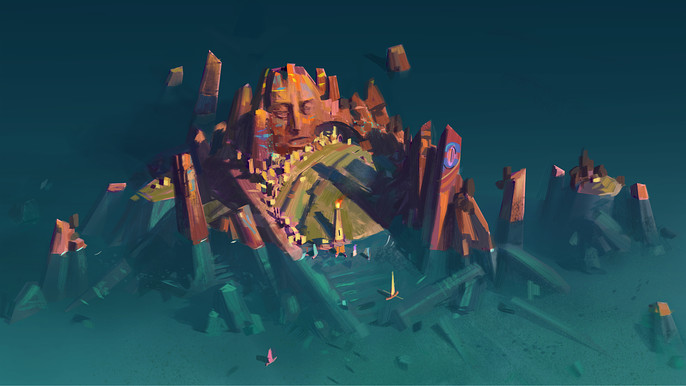
The “Worlds” contest was offering me a lot of that. The topic was very open and I picked many things that I liked and that inspired me: ancient ruins, water world, positive and life assuring attitude, feeling of revival. The story I thought of was simple as that:
"For centuries the world was dominated by ancient civilization of Atlanteans. They were giants and rumors of their magnificent cities are still told among humans. But Great Flood had turned the world into an endless ocean and buried the Atlantean civilization underneath. Only some of their huge temples and monuments are now seen over the water surface. Humans, a new race, came in and settled on these giant ruins sparking a new civilization."
I didn’t try to do a fancy story. I think the merit of an artwork is not in an originality of the story, but rather in a way this story is treated artistically and emotions that it triggers. The story itself may sound very simple.
Study
I think that knowing the subject you are drawing is very important. The more you know about it, the more convincing to viewer your work can be.
For this challenge I did the study stage after I have already done all the sketches, mostly due to the fact that there was an extra time given that I didn’t count on at start. But on my opinion it should be done at the very beginning, when you just have a general idea of the subject you are going to work on. That way you will have more ideas and imagination for the sketching phase.
In my explorations for this work I needed to get an idea of how the ancient architecture and houses of newcomers might look like. I thought of a contrast between heavy, simple, monumental, blended with natural environment ancient remnants and light, tiny, scattered sparks of buildings of new civilization.
Unsurprisingly I referred to ancient civilizations of our real history.
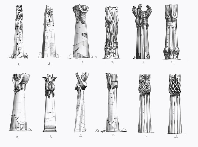
When drawing these pillars I watched Toltec, Minoyan and Georgian temples and palaces with their massive monumental forms. I also tried some unsymmetrical shapes and marine life motifs. Here I didn’t copy references but rather used them as a source for ideas.
Some studies I just painted directly from photo references, like this masonry of Incas and Toltecs.
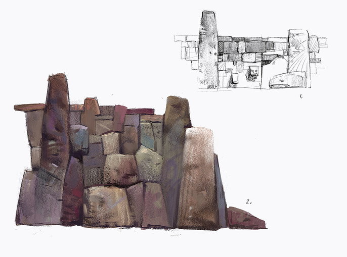
Here I wanted to grasp the feel of uneven scale and form of dry rubble masonry and subtle variability of color in it.
I would like to share a few thoughts about exploration phase in general.
It is quite common nowadays for artists to use references from the internet and it is ok when you have a tight deadline and time is scarce. But I think a better way would be exploring a subject by drawing it, and ideally by drawing it from life. That way you etch it in stone in your memory and can use it later with ease. You get knowledge of the subject that you can apply for future projects. This knowledge becomes part of your skillset as an artist. That definitely requires more time investment but it pays off in the long run.
As an example, if a character artist often works on medieval or fantasy subject or expects a large project on that theme, he may spend some time drawing medieval armor or dress in a local museum. That knowledge of medieval armor can be applied not only in creating medieval or fantasy warriors, but also in designing heavy sci-fi futuristic armor exploiting allusion in forms and proportions.
Shaping the Idea
This is always the hardest and most mentally intensive stage of work for me. A seemingly clear vision of picture in mind can turn out to be very elusive when I start draw it on canvas. I would say that for an artist thinking means sketching.
What attracts and keeps viewer attention to the image at abstract level is a relation between different values. Big vs. small, dark vs. light, narrow vs. wide, sparse vs. dense and so on. By forming these relations artist creates a sort of rhythm, similar to one in music. Both in music and in visual art that is called composition and it is a key method for an artist to evoke viewer’s emotions. Composition is essential. It is a skeleton of your picture or scene.
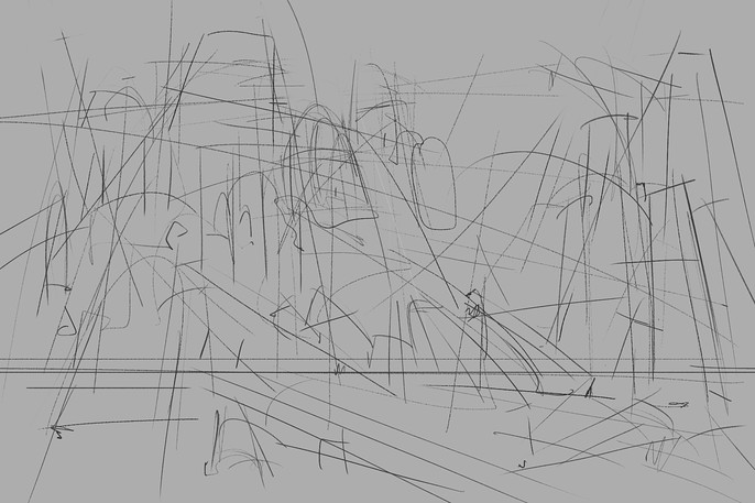
Usually I start working on composition with line drawing where I try to set up key proportions and line flow. These lines are like rails for viewer’s eyes that lead them to the primary point of interest, then to the secondary points, to smaller details and back to main subject and so on. I draw the lines almost intuitively but I keep in mind at least one main focus point and a couple of secondary.
I also try to pay particular attention to shapes that form the image. Visual proportions of shapes and their silhouettes are important components of the compositional rhythm. In other words I try to divide the image plane in a beautiful way.
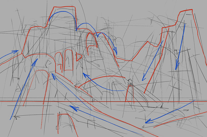
Once I feel that those lines work good as a composition then I start adding volume. Things can look a little different with volume added and I continue adjusting silhouettes and proportions. I use no more than 2-3 tones to keep it simple and clearly readable. I try to find strong proportions of dark and light tones and silhouettes in relation to each other. It is also important to combine areas with details concentration and sparse areas. Dense contrasty areas are good for primary points of interest.
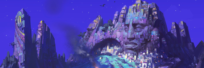
At that point I have already had an idea of stone face carved in rocks and I used that “portrait effect” as an additional emphasis of the main point of interest in the image.
While playing with all these abstract substances it is important not to forget about emotion and idea you want to bring to viewer.
Making Choice
In my experience most often first sketches are much less interesting than those that come out later. That is why I try to do as many sketches as time allows me. Or until I start to see that I am tired of the subject and stop seeing any improvement. Then it is a good time to take a break (a couple of days if possible). With a fresh view strengths and weaknesses of each sketch become much more apparent. It is also good to receive feedback from other people at that stage. Their point of view can show some aspects that artist haven’t even thought of and help to overcome his unconscious pre-judgements. At the same time a multitude of opinions can be very embarrassing and taking them all into consideration won’t do well for the artwork. So it is important to filter feedback and apply only what you feel a relevant judgement.
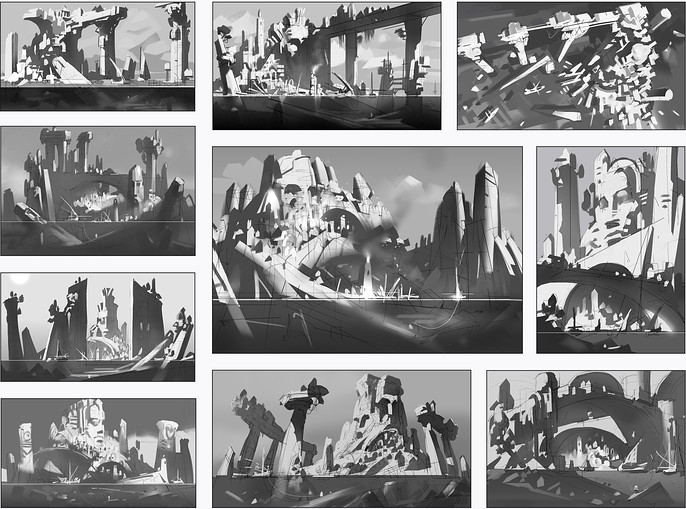
If I would find that the first sketch is the best, that wouldn’t mean that the rest of my work was in vain. In that case the role of other sketches is to show me that my first solution was optimal in that particular situation. Also those other sketches can be used as a basis for future artworks.
At the time I still wasn’t sure which sketch to choose for further development. There were two variants that I felt I like the best and I moved on with these to the next stage.
Exploring Color Solutions
Everything told in the previous section can be applied to color sketches.
The more color sketches I do at the beginning, the more interesting result can be in the end. Honestly, the first couple of sketches I threw away almost immediately. They were really bad.
As was expected the best color sketches appeared in the end.
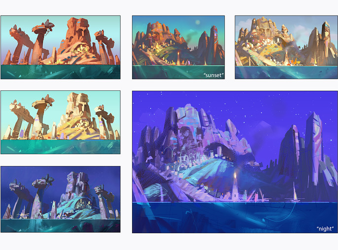
Sometimes I just feel I hit the spot and that was the case with two last color variants.
I already favoured the composition with more massive rocks and a stone face. I liked both “sunset” and “night” versions of it. Maybe I liked the night version a little bit more but for some unknown reason I was thinking of it as less suitable, as if it was too uncommon for a concept. At that time I was receiving some comments on the contest forum where people were very positive about the “night” version (my gratitude to @jonatan-moonchild). And finally I decided to continue with it. This is a good example of how other people’s opinion helps to overcome your own biases.
Later on I used “sunset” colors for layout sketch of the environment.
At that stage I was quite happy with the sketches and I could say that more than a half of work was done, and it was the hardest part.
Final Illustration
Well done sketches are a good foundation for final phase.
I was still thinking of the same relations of values but within general composition that is already set up. The most tricky thing here is to make each detail so that it enriches the picture without ruining overall composition. I usually start with main point of interest then switch to secondary ones.
Sometimes I find that area I was working on so diligently looks off and spoils the overall image. Fortunately digital media is very flexible in solving such problems. But to be more efficient I try to avoid spending much time on one part of the image. Instead I switch from one area to another as if painting them all at once. It is critically important to control the overall look of the picture. Navigator window or any other tool that allows artist to see both fragment and the whole canvas at the same time comes in very handy here.
When working in order from most important parts of the image to secondary ones you eventually may find that some areas are good as they were on a sketch and do not need any extra work. I didn't touch the sky on my image as it fit in pretty well though I could add some subtle shades of color and clouds if I had time.
Another tricky thing for me at this stage is that I become worn and tired of the picture. If you can afford a considerable break in work this may help you to look at you image with a fresh view. In most cases this is an unattainable luxury. But you can ask for a feedback the people whose opinion you trust. My friend designer advised me to flip the image horizontally, add some space to the right side of the flipped image and make some other minor adjustments. By that time I could hardly see any ways to improve the image yet I was feeling that something is not right with it. So my friend’s advice was very helpful.
Not Just an Illustration but Concept
According to contest requirements I was due to provide a concept sheet with all the key sketches put in it. I was thinking of a concept sheet as a part that provides additional information about the environment concept and could potentially be used by modellers and lighting artists in real production pipeline.
That motivated me to experiment with 3d and build a simple blockout of the scene as I imagined it. I spent a good amount of time on it and it didn’t seem to me an efficient time investment.
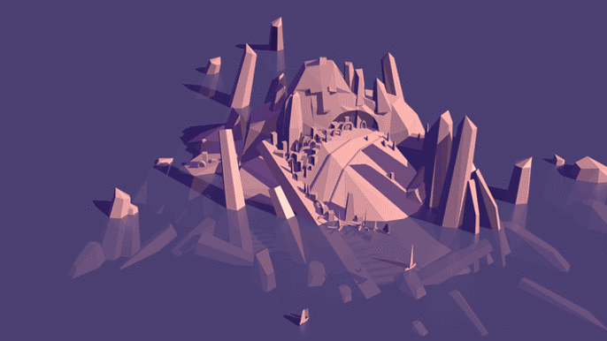
But eventually I used this 3d blockout as a basis for the layout view of the scene. Considering that I have already had a nice “sunset” color sketch, I created it very quickly.
Also I put some studies of architecture that were relevant to the final concept. Color sketches served as variants of light setup.
Conclusion
Creating any artwork is a complex process and there are many ways of doing it.
It really helps when you have an established workflow and I hope that sharing my experience about working on “Worlds” challenge become helpful for some of you.
At the same time the workflow is also a subject for constant change depending on the conditions and type of work.
Finally don’t forget to enjoy the creation process. Often a journey is more important than its destination. :)
Pavel's Cubebrush Store can be found here.