The Making of Theta
“After our long uncertainty and attempt in seeking extraterrestrial existence, an ethereal being finally responds”.
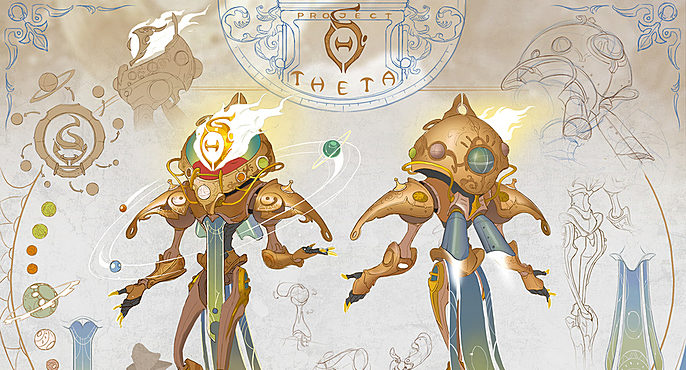
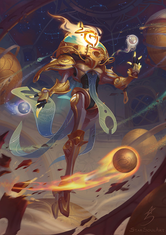
THETA is a living star that powers his mech with his seemingly infinite energy source.
Hi! I’m Kati StarSoulArt and this is my thinking process on how my Art War 3 hero, THETA, was made. Before I go through the making of this character, I want to show you one of my old paintings from 2015:
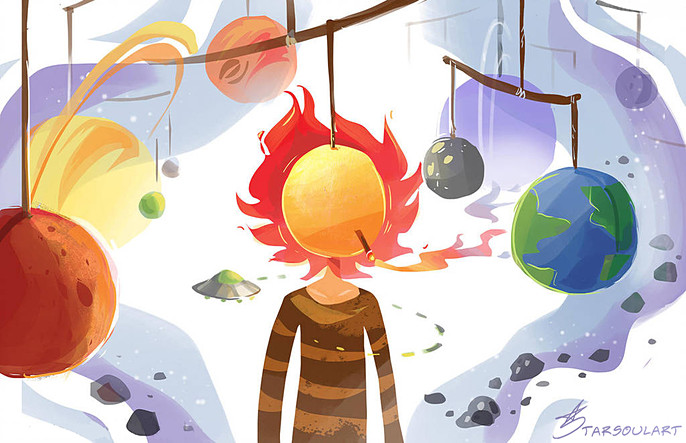
The idea that would later become THETA goes back many years ago and it was from this whimsical drawing. I’ve always wanted to create a character with this kind of surreal space theme, but I let my idea sit and left forgotten as I move on to other life matters. A long time had passed, then an opportunity came: Art War 3 challenge! So I thought maybe it’s time I make a workable character from this theme: space!
Character Concept
The only thing I took from my old doodle was a starting idea while the rest I was on my own figuring out how to develop this theme to become convincing enough for an ethereal space-mech hero I had in mind.
The universal idea I can use is the concept of gravity and how the planet revolves around the Sun. There, I have it! Now make it interesting, while supporting it with some logic. Since the Sun is an energy source, maybe it can power something... a machine maybe? Yup that’s it, a star powering a mech! So, this star is probably alive then!

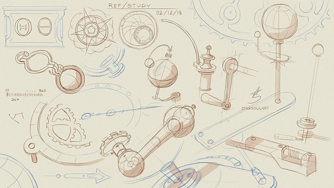
What kind of technology should it be? I decided to go for brass technology since steampunk has my favorite aesthetics. My references are an orrery, vintage diving suit, and submarine parts. I added a diving theme because if there’s one thing about oceans and space, we dive in both!
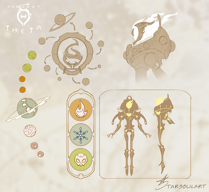
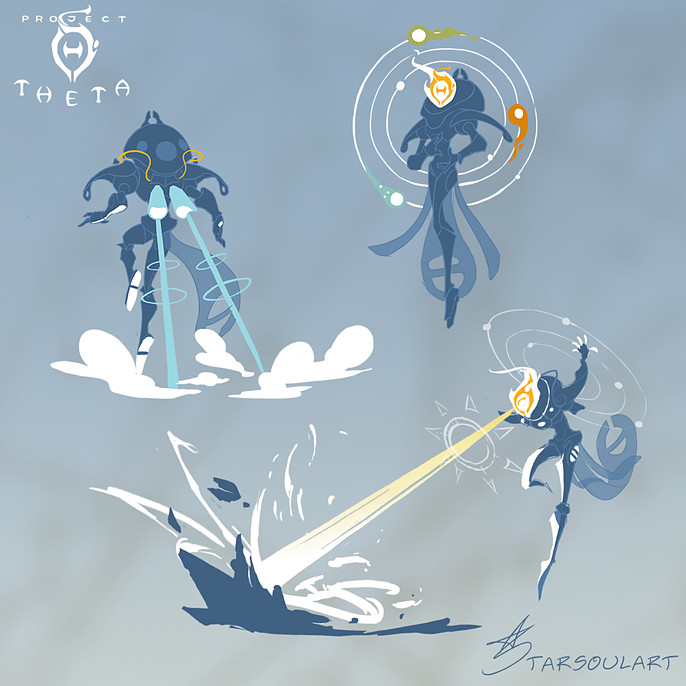
His power? Gravity and heat, of course! Hovering metal planets should do the trick, and also adds stronger visual to my concept. Further thinking, there needs to be a place to hold the planets. Having ring effects around his sun head as he uses his power should give a nice outcome, so let’s make holes around his oversized helmet for planets to fit in! It’s a very straightforward thought, but if it works, then it works.
Building THETA
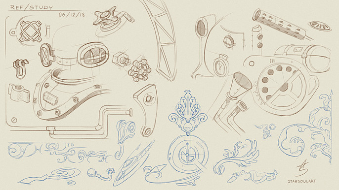
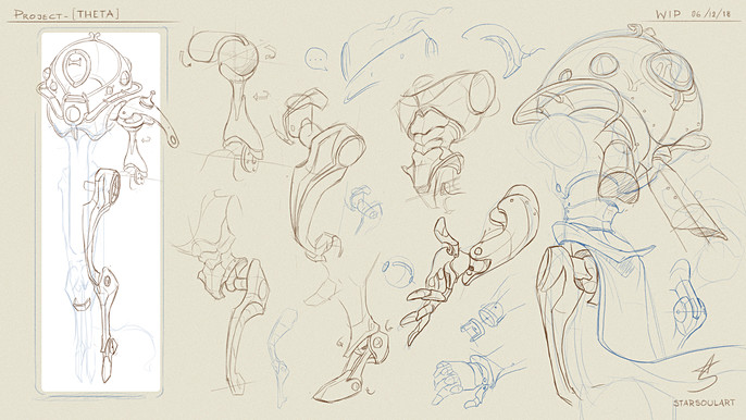
Before I began, I drew studies from my list of references to get some aesthetic ideas from the steampunk era. I also drew further studies of basic robot joints to understand the mechanics behind it. I’m not a mech expert, so this is the best way for me to understand its basic idea.
I used the term build because, in a way, THETA was literally ‘built’ by piecing all the robot joints and steampunk parts together. I took this opportunity to try out this approach since I tend to understand things by imagining how it works as it connects with the character rather than doing multiple silhouettes.
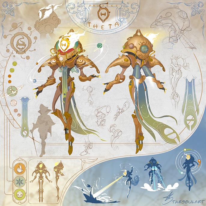
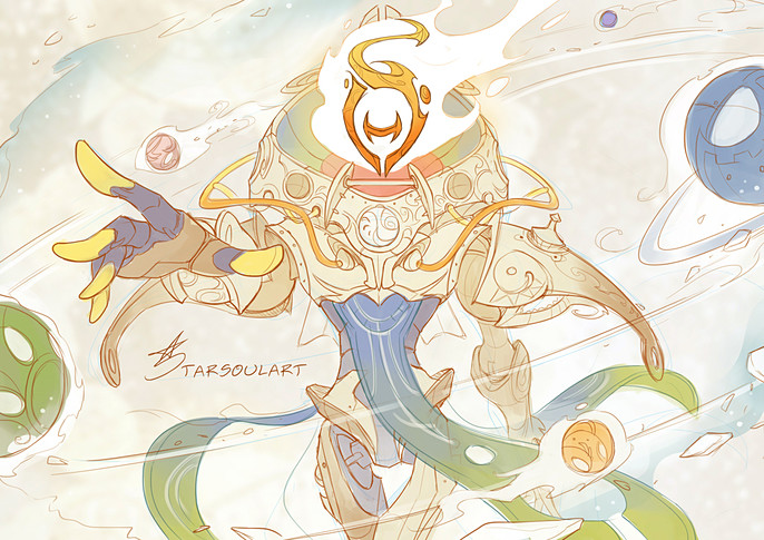
Once I had a solid idea on how the overall design looks like, I finalized my design with a clean line art and flat colors with cell shade. I didn’t render the character because I found my line art more appealing, and I could do it faster. As long as it explains what and how the character looks like, I felt that it already fulfills the idea of a concept sheet.
Color Palette
I followed the same direction as the theme and technology I had chose. Same material has same color, so THETA is made mostly with brass, while other colors are unlabeled metals for some variations. The cloths are blues and greens to balance out the warm colors.

And he’s done! Here are some elements I notice that supports the character's design aesthetics:
Functionality: Although the character is an ethereal being, I convince myself with some logic, with built mechanical parts base on researches.
Colors: Besides my reasons for the color choices, the color palette also adds to his heroic character.
Values: His star head is the main focus because it shines the brightest!
Shapes: Spherical paths and steampunk curves are used throughout the character. There’s a nice invisible arc I can draw from his left shoulder armor, over his head, to the right shoulder armor.
Space: Most of the details and skills are placed on his upper body, while having resting space in his lower half.
Trivia: I took the idea of how stars are labeled in astronomy and gave the character a hovering Greek alphabet made of carved metal for his face, so I can also tell which way he is looking. The letter ‘θ’ has the shape and meaning I’m looking for, hence ‘THETA’ becomes his name.
Note
Imagine: “If I’m a star in a mech suit that can levitate myself as I damage enemies with my rotating planets and shoot hot beams from my face, will I be happy looking like this?”
As crazy as the question sounds, and even if your answer is “Yes, cuz I’m hot!” it’s a quick way to check for obvious flaws in your design by putting yourself in the character’s point of view.
Layout
If there’s one thing I’m willing to spend time on, it’s the layout. This challenge taught me that having good layout matters, like really really! How the character is presented can make a huge difference in making good first impression. From all the great comments I received about my entry, the concept sheet gets most of the attention where some pointed out specifically that they really appreciate how I layout my subjects.
My layout is based on constellation maps where the main subject is in the center with more detailed information surrounding it. So, I placed all my subjects in a way that gives the same rotating effect as the star maps. I also purposely chose the layout that fits the character theme.
I treat layouts the same way as I plan my illustrations. I list all the drawings and explanations I wanted to put in the concept sheet and arrange them with different sizes and color. It takes time, but for all the effort I put into my designs, it is definitely worth it!
Illustration: Planning
Time was running low when I reached this stage, and it affected many of my decisions in order to complete the illustration.
Think, Kati!
Improvise a new strategy and keep running!
I used Photoshop to complete the whole process, starting with value thumbnails for my illustration. I was imagining THETA in an orrery room using his power during night time where constellations can be seen. I varied my thumbnails in terms of character pose, camera angles, and storytelling elements. I looked for the one that I feel is not too ambitious, clearly shows the character’s design aesthetics, and has the pose that fits the character’s personality:
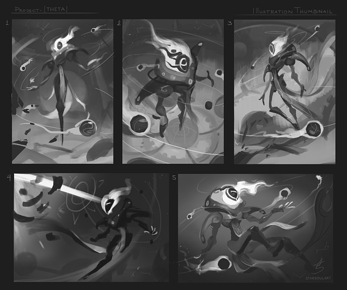
1. Has a clear story and it's centered composition feels very safe.
2. Really is a nice choice. The dynamic's there, but also with a sense of intimidation I don’t prefer.
3. Would be my choice if I’m not doing it for the challenge. He’s in a calm, wandering state.
4. Differs by trying to have him shoot sun beams as his power. Slightly too ambitious.
5. Definitely is my favorite; has a fun delicate pose though it doesn’t fit his personality.
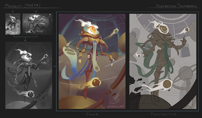
Number 2 had the pose and composition, while 5 had the emotion and flow. So, I combined two thumbnails to get what I wanted. The one I ended up with definitely was not the most interesting, but it had the balance and my confidence that I can make it to the finish line with a well-rendered illustration. I did a color test to visualize the final result, drew over the thumbnail to correct some perspective issues, then move on to the rendering stage.
Illustration: Rendering
I guess it is better explained if I show it, so I dug through my Photoshop files and pull out some of my layers. I painted in a way to get similar effects as 3D models and their render passes. Here are the main layers that made up this character:
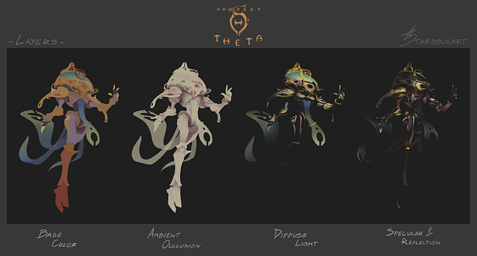
In short, this method simulates how light interacts with objects in reality. By understanding it, I could control factors like colors, light direction, and materials while keeping my rendering as realistic as I could with my painting ability.
Other than that, I touched up my illustration until the whole thing was complete. As I started working on the background, I had to adjust things that was either bothering the character or there was something I could change to improve on.
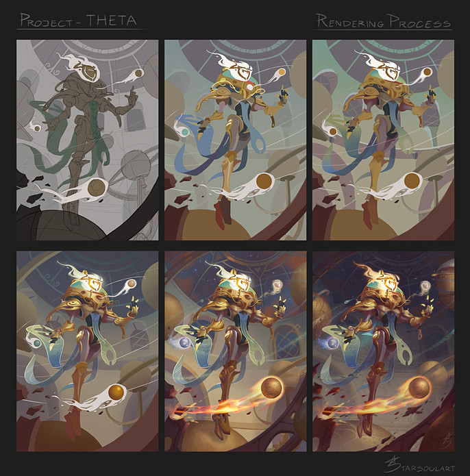
My main challenge was making sure the character and his power stood out from the background. These were some changes I made:
- Increase dust in the atmosphere to push depths between the foreground, the character, and the back room. It also helps cover unnecessary background noises.
- THETA was supposed to stand on the big orrery planet, then I decided to make him levitate for better flow in his upright posture and it gives stronger impact with his active power. The big orrery planet was pushed farther back with atmosphere dust.
- I darkened the room because his power, especially the ring paths where the small planets are traveling, weren’t showing as clear as I expected.
Until then, I made some final color adjustments to get the mood I wanted and finally...
Yes! He was complete just in time to submit my entry!
Final Thoughts
Aim for good impression! You don’t have to be the greatest artist in the world to do so, you just need to understand yourself and use whatever skills within you in the most efficient way.
Show your strength and look for any smallest details that can be of your advantage!
Most importantly, enjoy the design process!
I will end my story with this fun sketch I’m doodling! THETA’s idea comes a long way which gives this character a strong connection with me. I value my characters as they are memorable parts of my art journey. As I strive for progress, interestingly, they change as well. Thank you so much readers! I hope it’s a fun and inspiring read!
Check out Kati's full interview here.