
2D Digital Art Tutorial- Witch
My name is Michał Sałata. I am a graphic designer and currently working in the video game industry. I mainly do concept art and illustrations. This is my first tutorial, I hope it will be helpful for someone.
Idea
When starting a new picture, I always ask myself two questions: WHAT do I want to show, and HOW do I want to show it. So it can be simplified to: content and form.
At the beginning there is always an idea or inspiration that makes us interested and creative. It is such a force that drives our action.
In this case, I knew from the beginning that I wanted to draw a young witch. I am a fan of everything related to horror, but rarely have the opportunity to draw such characters in work. For art challenges like Art War, I chose a topic that interests me.
I think that to do something good, first and foremost, do it for yourself. Then there is a greater chance that people will appreciate it. However, I did not want to make a character in the style of horror or gothic because I've already saw a lot of such works. That's why I was looking for something a bit different. I always try to look for something new or less popular- where there is space to create something new. I wanted to present a witch character as a school girl who does not differ from her peers on a daily basis. Placing her in the 90’s seemed to me something interesting which I definitely wanted to check. I immediately came up with ideas for accessories from that time, especially the walkman. That's how the music theme appeared.
The cassette has become an element of performing the magic skill.
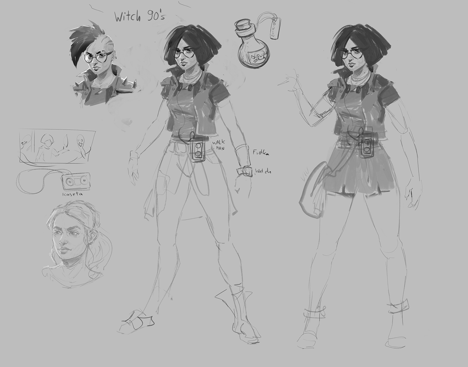
Sketches
Once the idea is clear, it's time to design the character. For this purpose, at the beginning I am making quick sketches to get into the topic. These sketches are not to be beautiful. They serve rather as a kind of graphic notation, to write down thoughts.
Most often I have the appearance of the character in my head and I know what elements it will have. The most important attribute of the character was to be a walkman and a magical cassette with hits playlist. Who grew up in the 90’s and had a lot of them:) Besides, I decided to add a familiar, because every kid should have a wild animal friend.
I usually draw a few variations to see which ones look best. I draw several variations of the head, because it will be the most important part.
The simpler the sketches are the faster the iterations.
References
Since I chose the 90’s, I prepared the references of popular clothing in those times. And also film references, photographs that refer to my subject or simply have an inspiring mood and atmosphere. References are my information about how specific things or people look like. If I do not know how to draw something, I am always looking for photos to understand how something looks and works.

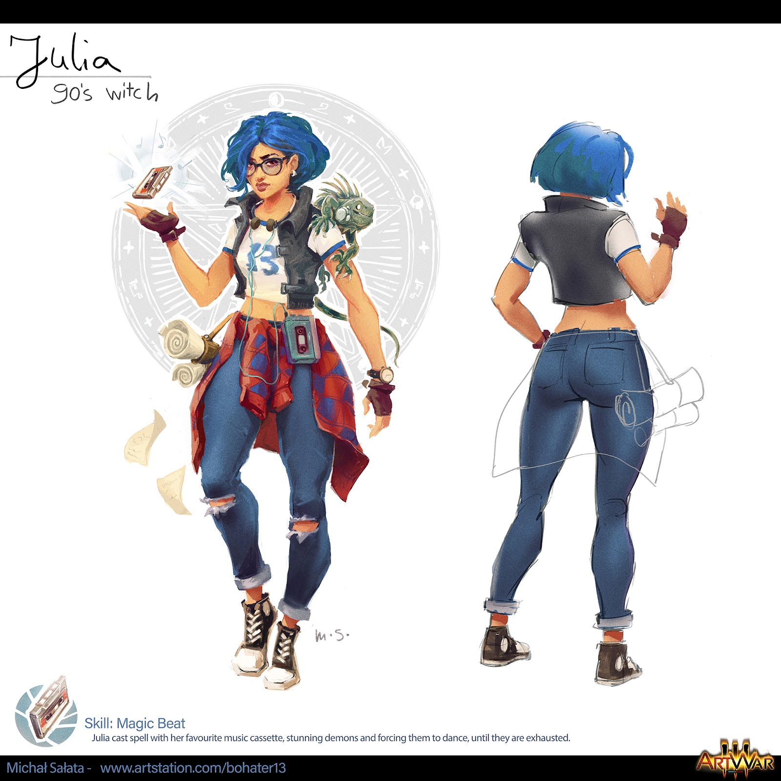
Concept Art
This is what the concept looks like. Most often I start with a black and white drawing. This is the easiest way to judge design and values. Besides, I think drawing and lineart are the fastest way to express your ideas. I very often flip the canvas horizontal to find bug (I have a shortcut to this to save time).
When I use a function very often I definitely set up a shortcut for it, it saves me a lot of time to search in menus.

When I'm happy with the drawing I put on the color. Most often I use layer blending mode for this like: pinlight, overlay or testing other. I use a lot of gradients map for individual parts. Some of them are from Marc Brunet.
I also make masks for elements. Then I use clipping masks to paint on top.
I try to give only the necessary elements that support the character and to avoid the unnecessary detail.

When the concept is ready, I always put it away and look at the next day with a fresh eye. Then I ask for feedback from friends and on the forum. Very often people notice things that we do not see because we lack the distance. Most often, with feedback, the work becomes better.
Illustration
Here, I start to think HOW to present this character. I wanted try to achieve a similar effect to League of Legends splash screens. The work should have good readability and clearly communicate what we want to convey. I prepare sketches, miniatures of frames to quickly check the best compositions.
At this point, feedback from friends and from the forum is helpful. The intention was to show the witch using her skill and be surrounded by dancing demons. I also wanted it to be the evening time with the source of light behind the main character. Initially, I thought about the open space and the moon, but eventually put the scene in the cathedral with the stained glass as the point of the light.


Final composition is really sketchy, but it shows what the final art can look like. In this step, it is sufficient. I also set the test color and mood for the scene. I always check on thumbnails or reduce the size of the sketch to check if it is still readable and see what is in the picture.
This is the crucial moment that will decide about further work on the illustration. It is worth devoting a lot of attention and not going to the next stage if we are not sure that the composition works.
Rendering
For better selection I split the picture into a parts: cathedral background, demons, main character and cassette with fx.
I’m starting with painting background. I’m using references from unsplash.com, they have a lot of cool photos. I paint a stained glass window separately from the front. It's easier to paint then I place it using the transform tool.

I paint demons separately, each on a different layer to make it easier to move and scale. And also clipping masks are irreplaceable.
For dancing demons, as a reference, I’m using an action figure that’s on my desk and watching a few music videos (especially Thriller by M.J.).
For now, I do not care if the demons do not connect exactly with the background. I will deal with this later with levels and color balance, for the moment I just want to have content for further processing.

I start to paint the girl's face to determine her appearance and see if she will be an interesting character. It will be a very important focal point as we always focus our eyes first on someone's face. I’m using blending brushes for hair and some parts of the skin.

For the pose, I use references set earlier in the Daz3d. I'm exporting pose models to Marmoset to set the lighting. The lighting can be set there in real time.
These two programs are easy to use and they can help a lot when I'm not sure about perspective shortcuts or lighting.

When I already have individual parts of the picture ready, I start to work on them at the same time. I put them together and work on the coherence of the whole picture. Below you can see a few steps: 1) all parts together 2) cassette with particles 3) left hand drawn from scratch and some rendering 4) details on character and more rendering of all picture

On the third picture I've drawn the left hand over again because the previous one looked strange after painting. During the rendering process, there are situations that you need to draw something differently or completely new. As a reference for human hands, I use photos of my own hands or application.
Handy.
Final
At this point, I often flatten the entire picture and start to test the full screen filters.
I'm again using gradient maps, sometimes with layer blending mode and adjust opacity. I do not put them on the entire picture, but only mask the areas I want to color. Another interesting option is color lookup, where you can use Lut to add filter on an image. It's very easy to exaggerate with such effects, so I control them with masks and opacity. I also use level and curves and check the values on the scale of gray. Then, of course, I flip image horizontal.
When colors, tones and values are set, I start to add effects suggesting photographic lenses.
Which are lens blur(depth of field), grain, chromatic aberration, some texture imperfection like scratches and dust. But not too much, I do not want to overdo it. Such an effect should not be the first to be seen, rather it should enrich the picture and not draw attention from it.


When the illustration is ready, I put it away for one day then return and look with a fresh eye. Most often, some minor corrections must be made.
There are always things that I would like to change or correct, but you have to keep the deadline. This is another thing that challenges teach us. Keeping deadlines is very important for any kind of production.
Thanks for your attention! I hope you liked it.