
2D Digital Art Tutorial: Eryl: The Hidden Guardian
Clarissa Ferguson is a Graphic Designer (B.F.A.) and a self-taught artist both in digital and traditional media. Art has always been a passion of hers. She strives to continuously to grow her skills in both illustration/digital painting as well as her graphic design skills. Here, she takes us through the creation of Eryl: The Hidden Guardian, a 2D finalist in Art War 2.
Character Ideation
In the first steps of creating my character I had to really think about his story and what purpose he would have in this world of good vs. evil. I would usually write down a type of biography about the character before even thinking about how he or she would look. Understanding the personality and background of the character I think is what gives a better idea on how the character should look, act, and so on.
For his mini story I wrote: “Eryl is a humble guardian who was once a part of an ancient race of powerful guardians. Their purpose was to protect and serve. However, conflict rose amongst them, some believed that instead of being protectors of life-forms so much weaker than them, they should be worshiped and praised for their heroics and immense power. Others refused such haughty ideas. But these simple thoughts brought civil war between the guardians. Eyrl is the last of his kind, mentally and emotionally scarred by the war he refuses to take part in any conflict. All he wishes to do is live a peaceful life among his human companions but this Art War was too massive for him to ignore and he needed to sacrifice peace to defend his new home.”
Composition Process
So down below you can see little notes attached to his first concept sheet. I do write quite a bit next to my doodles to remind me of the story that I had in mind to begin with.

I think the exploration process is really fun, I get to experiment with different clothing ideas, hairstyles, and more physical-cosmetic features. I had the idea already that I wanted him to look strong, clean, and have strong features (like a sharp jawline, board shoulders, neatly maintained hair, nicely dressed, etc). Not necessarily someone that wants to show how “cool” he is, but just to fit within his character of not trying to show-off or stand out too much since he just wants to live very peacefully.
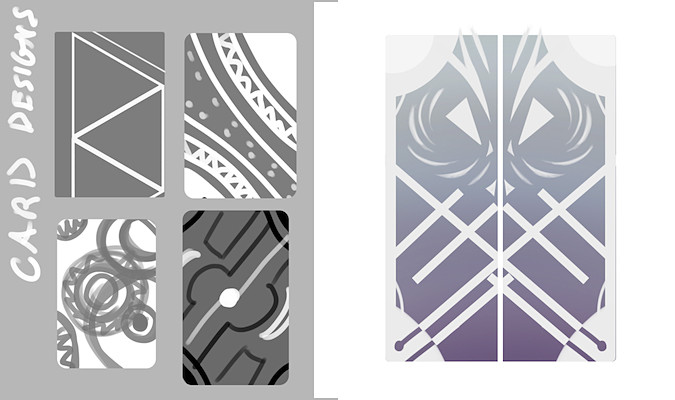
For this image below, I was exploring more deeply into how he would look and his weapon, but I didn’t want to use anything too common like a sword or a hammer. Since he doesn’t like the idea of conflict it wouldn’t make sense for him to have a weapon or at least a very obvious weapon. I picked a few items like marbles, playing cars, and a hula-hoop type of weapon but settled on cards since they can be very versatile and he can use card magic tricks.

I think figuring out what he could do with the cards was the hardest part but I did get some lovely advice from other users suggesting the many different possibilities. I figured I could treat the cards like a type of “building tool” meaning he can make whatever he wants out of these paper cards. He can make his own shields, dual swords, daggers and so on. He simply can manipulate the cards to any form he wants.
Clothing
I wanted his appearance to be clean. He needed to be approachable. I thought keeping his human appearance would be the best option since his human companions can relate to him better. Even when he goes into his guardian form he isn’t too far off from his human appearance. In his guardian form light radiates from his upper torso but he is able to hide it. As I was going through these different outfits I figured it would make more sense for his upper torso to be more exposed since light can radiate heat I didn’t want his clothes to burn away! Having a more open and air outfit would have been best plus he shows more of his concept design in the earlier drawings.

Introducing Color
As you can see in some of my concepts I work in grayscale. I never really focus on color until I have a solidified idea. Once I figured out what he was going to wear (combining two outfits that were my favorites and other users’ favorites) I then focused on his colors. I wanted him to have approachable colors, again thinking that he needs to not be a bright spectacle nor someone who is hidden in the shadows. I overlaid different color combinations using some of a similar palette. I changed the hue slightly or would adjust the values of those colors. One of the main colors I had in mind was blue and yellow. Blue is calming while yellow is a happy and bright color. I think another reason why I chose blue and yellow is because of my experience in an honor society called Phi Theta Kappa. Our theme colors were a royal blue and golden yellow. They promoted hard work, purity, and integrity; I believe that translated over to my character and I wanted to appear as those things. An honorable warrior!


Composition
Coming up with the composition wasn’t too bad, since I figured out what kind of person he is. I wanted the scene to show his abilities and to show him being the protector that he is. Like with the majority of my work, I create thumbnail sketches first. Just simple 2 or 5 minute sketches of the scenes I had in mind.

After I have done my thumbnails I was struck on two ideas:
1. Eryl demonstrating his power. I wanted to display the use of his cards while giving a sort of introduction to the character.
2. Eryl defending the innocence using his cards has a huge shield blocking the opposing forces.
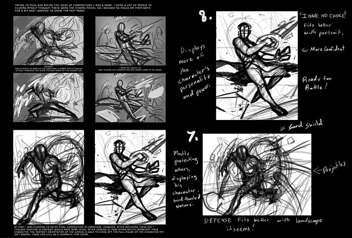
Both concepts I tried to develop slowly, but I was starting to favor the first concept more than the second and continued to develop that.


Working in greyscale once again, I always want to make sure my values are in check. For me personally painting in values is a little bit easier than color. I focus on the mood that I want to convey then add colors later on.

Before I continued painting the picture I did a few mini color roughs before settling on a color scheme I liked.

This process is usually the longest. After I figure out my colors, I finish the greyscale and move on to color. Rendering takes the longest but it is fun and calming process! When I color my greyscale pieces I do not have an exact method. I pick blending options that would work best for the composition I want. I think for this piece I started in color, then used Soft Light, Overlay, Multiply and Color Dodge.
I don’t stop there, I continue to paint on top of the piece even after using some of the blending modes because sometimes it is better to paint in the colors yourself then to rely on the blending modes in Photoshop. Also I added his cards and his final special touches!

Final

That is really it! I hope this was insightful into my creation process of Eryl and how I generally paint. Again I’d like to thank all the contestants that helped me out during my creation of Eryl and thank Cubebrush for adding me as one of the first round finalist. I am honored to be amongst other amazing artists!