
2D Digital Painting Tutorial: Ra
Thomas Chamberlain - Keen is a Concept Artist and Illustrator from the UK, working at Atomhawk Design in Newcastle. Having learned a lot from participating in last year's Art War he is back again and fighting for the Light Side with Ra, the Sun Goddess. We hope you enjoy this walk through of his process.
Thinking
I will always start the design process by finding an idea that will transform the brief into a series of problems to solve. Generally you'll know if you've found something interesting when you find that this series of questions and answers grows exponentially. Another great sign is when the solutions you create further into the process start to link up and bolster previous design choices. I won't go any further into this here as I'll be repeating my thoughts from this tutorial:
Ablution: A Digital Art Environment in 4 Days
This design, however, felt like it could tolerate much more freedom in how believable it needed to be. I decided that my ultimate champion of light would be a God-like figure and exist in the realm of fantasy. As such most of my analytical thinking went into the visuals and how to communicate mood and personality rather than design functionality- which meant once I had solidified my idea I could go straight into making some pretty visuals.
Rendering

The first step was composition. I could have taken a more graphical shape based approach with silhouettes, however having already detailed out my design I chose instead to jump straight into line art. The real challenge here is to create a striking and dynamic pose for the character whilst obscuring as little of the design work as possible.
The more detailed line work approach meant I could work out if I could actually fit all of the elements of my design in whilst maintaining the easy readability. A couple of my other explorations (that I have included on my concept sheet) used more extreme angles with a lot of foreshortening, but this seemed to inevitably obscure something important on my character so I settled with a simpler angle and made up for it with a more extreme pose.
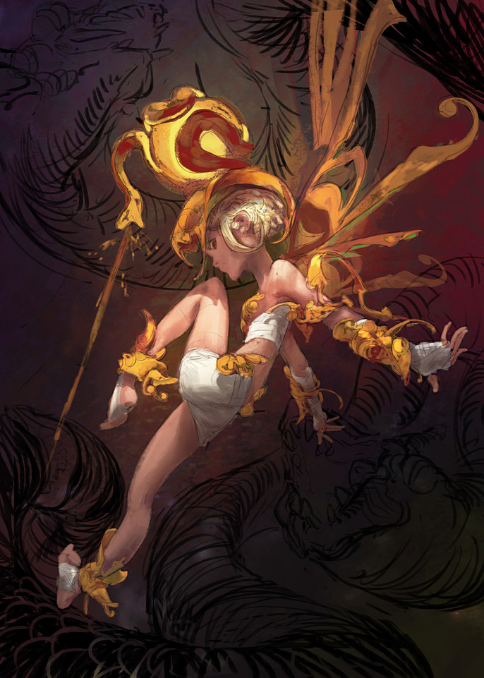
I slapped some simple colors in and just experimented for a while with color balance and the 'replace color' tool. This left some art facts in the metal that I actually liked quite a lot and tried to incorporate into the rendering later on. My aim here was to create a palette that used the dark subdued tones seen in classical dutch oils. Not only do I find these very appealing but I wanted to bring in the association with religious figures that were so often the subject of these paintings. I also hoped this would bring a timeless or ancient feel to the image as I imagine my character to be an eternal being.
Even though this stage is very rough I have been careful to place the major cast shadows accurately. If I find at this point that I don't like the shapes these produce then it's very beneficial to be able to fix this early on. I realized that by having the headpiece as the single light source I would have to push the whole of the face into shadow, generally not the approach you would take with the focal point of an image however I saw this as an opportunity to keep the eye moving around the image. Since the face has such an inherent draw and is composed centrally here it could trap the viewers eye so by reducing it's contrast significantly as soon as the eye comes back to rest there it will hopefully be distracted by something of higher contrast in it's periphery.
I then added the last major elements of the composition; the forces of darkness. I omitted these from the sketch as I wanted the composition to hold it's own with the character alone so the snake creatures would not draw focus away from my heroine. I wanted them to feel like they were completely surrounding her so they'd appear more menacing and to fill up the otherwise empty space in the image. A happy accident occurred with the top snake wherein the way it curved above her head looked almost halo-like, which was very suitable for the depiction of a deity.
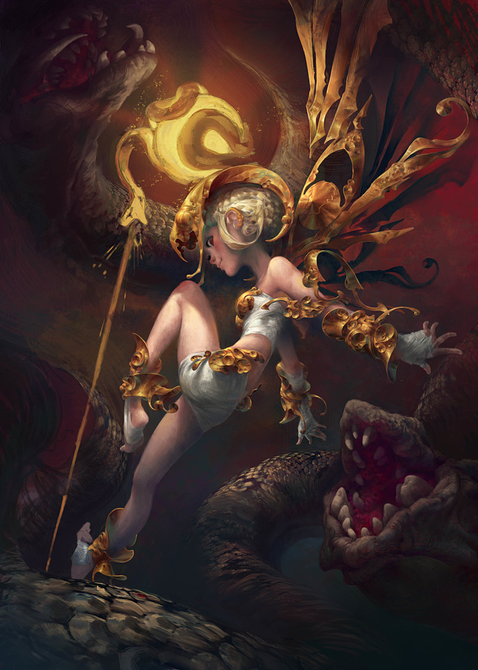
Here, I start to go mad with the rendering on the metals. I hadn't done any material work this detailed before and I was really enjoying it. My thoughts were really just imagining as carefully as possible the angle of each surface of the metal. This angle then dictates the base color onto which I worked in the cast shadows and areas of corrosion that resulted in the nice green-y blue that occurs when the metal oxidises. To keep the metal work from feeling overly detailed I followed the big-medium-small shape design rule carefully to ensure an interesting hierarchy of complexity. I also took liberties in the accuracy of the lighting in areas that needed more or less contrast for the sake of the composition.
To further the interest of the rendering I started to play with the contrast between hard and soft edges. In some cases losing the edge completely really emphasized a shadow without necessarily needing to push the value so far into the blacks, freeing up the option of going even darker in some of the more detailed shadows.
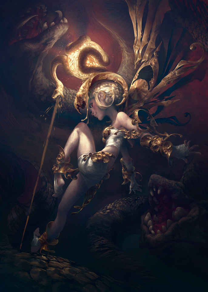
Having finished the bulk of the character detailing, I started to go off the slightly chaotic and mottled color scheme, so I put the whole piece through some rough color and level adjustments to unify the less cohesive elements. Whilst playing with the values and contrast I found a look on the metals that I really liked; essentially darkening all the values except the very brightest. This functioned like a weighted contrast adjustment; instead of a continuous distribution of values, I now had predominantly dark values, very few mid values and a small amount of the very brightest. This really emphasized the single light source as it made the specular highlight significantly smaller on curved surfaces. The darker shadows also lead to some very nice opportunities to lose the hard edge of the metal segments and exaggerate the environment's effect on the shiny material.
Final
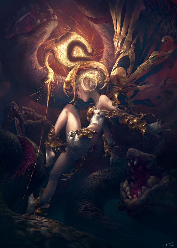
Taking the illustration to it's finish was very much a matter of filling in the areas that felt like dead space to me, whilst keeping the focus clearly on the character. I wanted to enhance the depth in the image so I tried my best to make the snake forms in the background feel solid and three dimensional to help build the viewer's feeling of space.
For the final touches to the rendering I played with more hard and soft edges, even putting in a fragmented effect coming off the most brightly lit surfaces. Along with the particle effects from her snake these brought some nice grittier detail that was missing from the stylized forms of the character. They also make for good secondary read details to hold the viewers attention for longer.
Finally, I added subtle touches of the good ol' color dodge to help bring in a strong feeling of warmth and radiance. Ra is after all, the Goddess of Light.
Thomas was just announced the 2D Winner of Art War 2! Check out his work on the Cubebrush forums!