
Digital Art Tutorial: Prism Valkyrie
2D Art War 2 Finalist Max Davenport takes us through his creation Prism Valkyrie.
Introduction
My name is Max Davenport. I’m 27 years old and I am a concept artist who’s been working in the game industry for 6 years. Currently I live in Dallas, Texas and work at Gearbox Software. Contests like this are likely to unlock potential in places you might not expect. For that reason, and the fact that I wanted something that would push my skills, I was excited to enter!
Concept
I decided I wanted to make a hero or protagonist character going with the light side theme. My go to is usually anything science fiction whether it’s robots, mecha, bio-androids or whatever. Starting from there I was getting so okay results but nothing I was truly happy with.

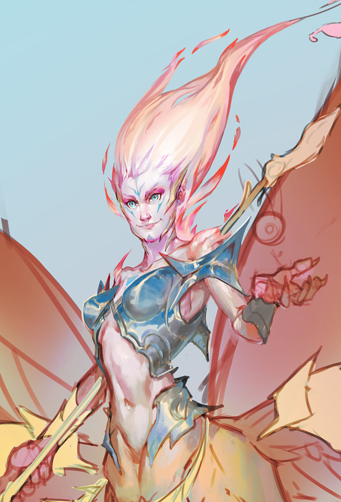
I initially wanted this idea of a winged or centaur robot character with an animal pilot all hooked up with wires and sensors but I couldn’t exactly figure out how to make that stand out given the theme. After a few sketches I decided that I really enjoyed the lion theme and that I could use that in a different context.

After digging through some references, the centaur and lion ideas stuck. I knew I wanted the character to be female and that I really wanted to push my use of color and light in the picture. Looking at traditional fantasy artists like Julie Bell and Donato Giancola gave me a place in my head to start with my piece.
Unfortunately, I didn’t take my time with the initial concept and started immediately getting into the illustration. For me it was less a marathon and more of a sprint.
If I could do this over I’d have gone in and spent more time on the design.
Illustration

With my initial sketch, I started working out the core forms looking at animal reference. I really wanted a bit of foreshortening in the wings to push the character out a bit. I fell in love with wanting to paint out every bit of the wings so in the end I feel like I could have done more with the composition. I wasn’t going to spend a huge amount of time on the line art seeing as I was just going to paint over it. Again, planning is key in a painting like this.
All in all, I felt like the pose and character were dynamic enough to move forward testing colors and style. I wasn’t really relying on a character backstory or a planned action. I just wanted something that looked impressive and had a lot of radial elements that felt like it was exploding off of the page (or screen in this case).

After getting a better sense of where I was going with the major colors and forms, I took some advice from the community here. I added more things like armor and a second set of wings to really add more presence and shape to the existing design.
Once I started actually painting I was getting into the real sense of the character. I often start projects different ways. Sometimes I do heavy line work and really adhere to the design and sometimes I just block in my colors and paint organically. This project was a mixture of both approaches either out of laziness or just persistence. Who can say? Regardless, I was enjoying myself.

At this point, I was starting to run into a few problems. My lack of preparation led me to finding an imbalance of contrast and tint in my image. I needed to balance out my darks and my lights and make my colors pop if I was going to get anywhere.
Again, the forums and community members were awesome and helped me work through these issues.

It was interesting approaching this painting without a full concept sheet in mind. I was able to make design decisions based on the composition of the character that I felt helped push it and make the painting feel stronger. In this case, I changed the weapon my character was holding from a spear into a giant, spectral scythe. Along with giving me a bit more contrast in the piece, I feel like it was just a stronger design element.
As I was nearly finished with the character I could finally focus on my background elements. My rough block-in was enough to help paint the character in but I was trying too much with my initial attempts. I was trying to focus on big effects and all of this other complicated stuff that was just mucking up the composition. It took me a few tries but I decided that I really wanted to paint in a rocky beach front and accent the light in the image with some tidal shapes and colors.

In the end, I was pretty happy with this project. I was able to focus on a few goals and execute on them to help bring it to the finish line. I wanted to focus on color, lighting and my materials and that’s where I think the image shines. Giving yourself criteria or simple goals for any project, whatever the scale, is important in growing as an artist. Focusing only on doing things one way and not diversifying your process is a quick way to grow stagnant.
Anyway, I had a great time with this and I hope you all enjoyed the contest! Cheers!
Follow Max's workflow on the Cubebrush forums and/or on Twitter.