The 'Making of' Akantha
David Villegas, or better known as, Deiv Calviz, is an illustrator and concept artist based in the Philippines.
Deiv’s expertise includes hyper-realistic and stylized illustrations. His career started at a local outsourcing studio involved in big projects such as The Last of Us, Uncharted 4, Sims 4, Dance Central 3, and Fifa Street.
Now a full time freelancer along with his girlfriend and finicky stray cats, he eventually plans to create his own worlds and stories and is welcoming any new opportunities to grow as an artist. Here, he takes us through his thoughts while creating 'Akantha.'
Idea
This is my second time to join the Art War contest at Cubebrush. I think this a great way to challenge myself while making a portfolio piece!
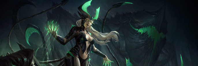
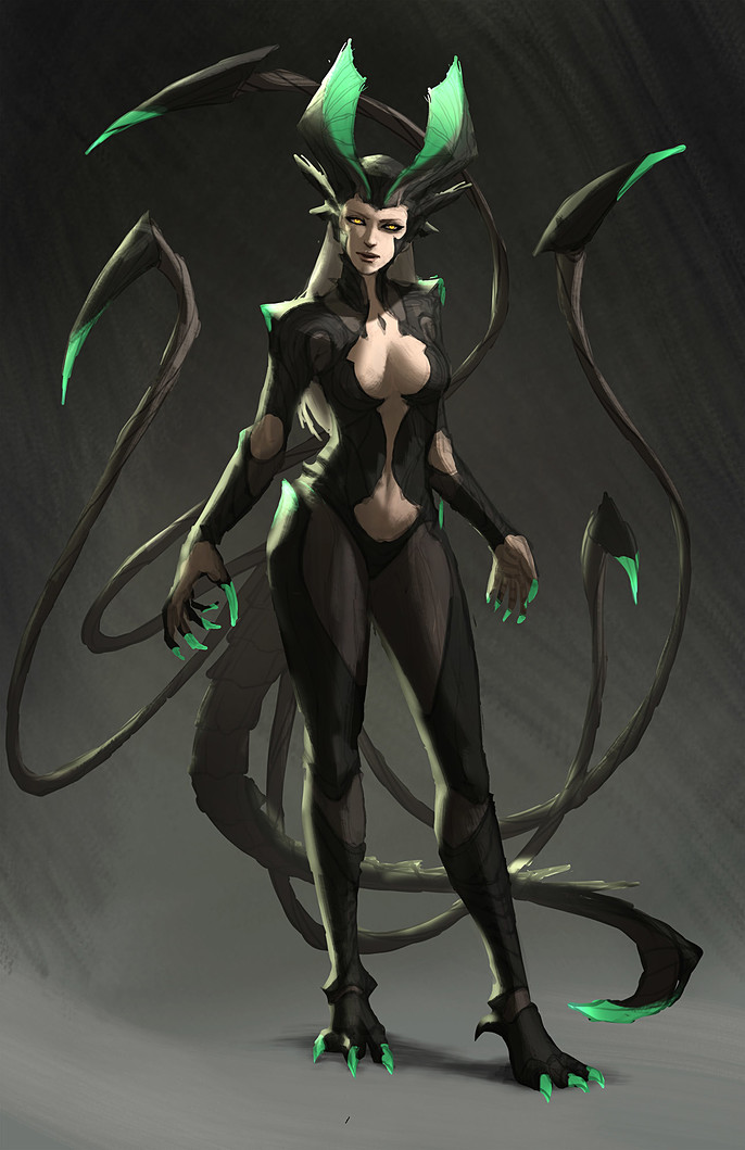
I instantly knew when I saw the brief that I wanted to create a demoness type of character. I recently played Starcraft 2 and got really inspired by how cool Kerrigan is so I wanted to try designing my own character with a similar feel.
I imagine her as a goddess who was banished into the underworld for her experiments with dark magic. She has the ability to summon creatures from the ground and took the form of a human with multiple appendages which she uses as a weapon.
Concept Base Sketch
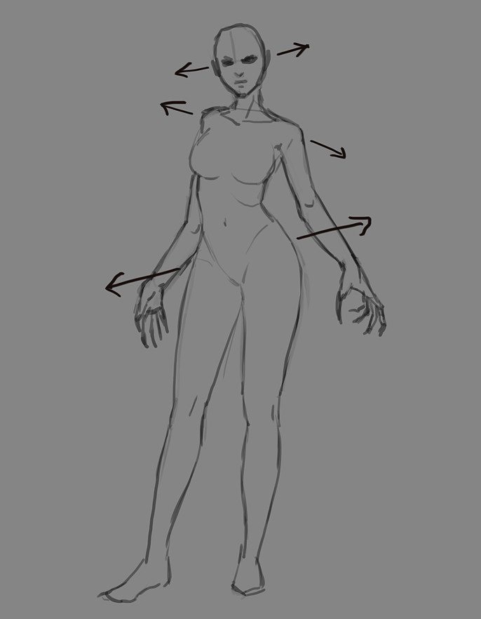
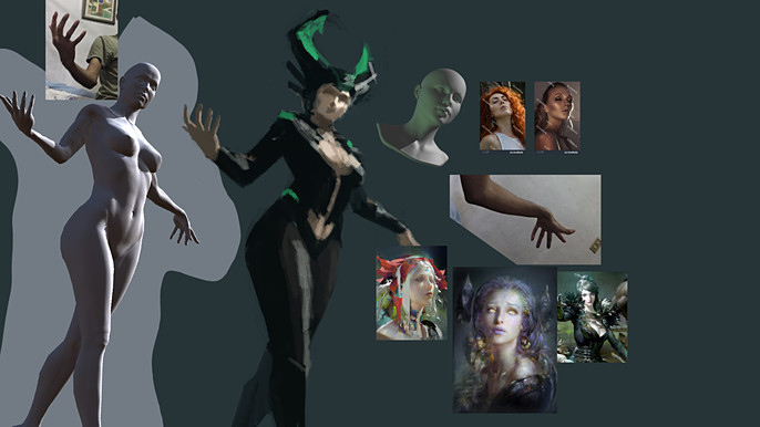
I begin by sketching a female human form. I want my character to have an alluring appeal, so it is important for me to focus on the feminine silhouette. I tried to make it a little dynamic by tilting her hips, shoulders and head alternately while keeping the balance of her weight. This step will help me draw the costume/armor without worrying about the pose and anatomy.
Design Studies
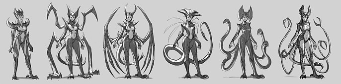
I decided to try my iPad Pro and use it to sketch the armor/costume designs. I realized that display tablets like an iPad or Cintiq, makes drawing lines more convenient. When designing characters, I noticed that with line art, everything is easier to figure out.
Once I have enough studies, I locked onto my favorite sketch which was the 6th one. I think it was just appropriate for her to look graceful and cunning and to not be as bulky as the 2nd.
Color Sketch
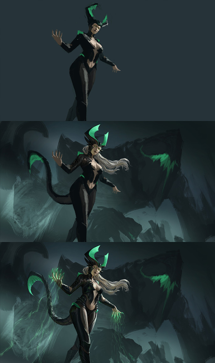
Next, I refined the line-art and did some revisions to her tentacles to make them flow better. I added in flat colors to figure out if the silhouette and color groupings make sense. I switched to Photoshop at this point because I am more comfortable with coloring there.
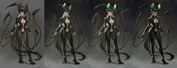
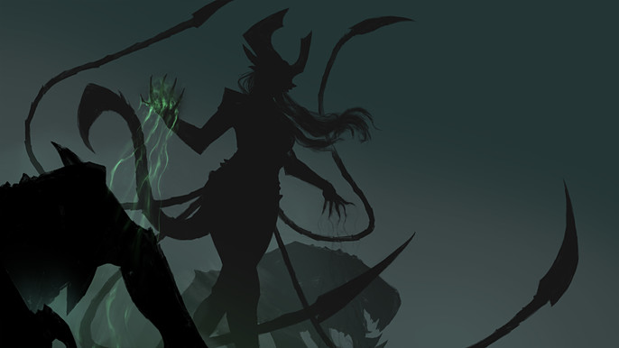
I define the lighting by adding a main source of light and a rim light from the opposite direction. I use a multiply layer to do the shadows and a linear dodge layer to do the rim lighting. This type of lighting emphasizes the forms and is effective for character concept art. I made her face half lit so that it will emphasize that her eyes glow and it gives off an evil but still human vibe.I also added green tips to her horns to indicate that they are either magic enhanced or poisonous.
Even if this is still rough, you can already show this step to your client or friends. This stage makes it easy to tell how it will look in the final without having spent too much time on it.
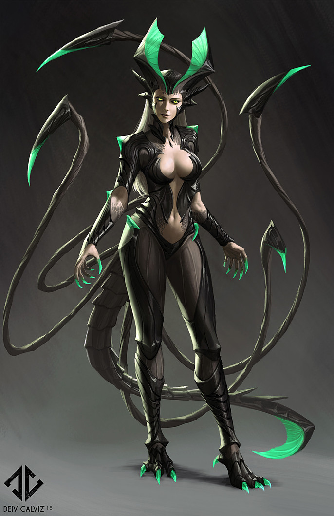
Front Concept
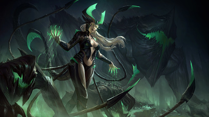
I just kept on painting directly onto the merged layers until I got the details I wanted. Some could say I rendered the front concept too much but I wanted a concept art piece that is in similar quality to those done by Marvel for their superheroes.
Back Concept and Abilities
Here I compiled my concepts into one sheet. I did not fully render the back view since its purpose is only to show how her tail and tentacles connects to her spine. I had a bit of time to add in some poses to show her abilities using her tentacles and magic. I also included a side view of her head. She has a reverse type of horn which I thought was interesting to do.
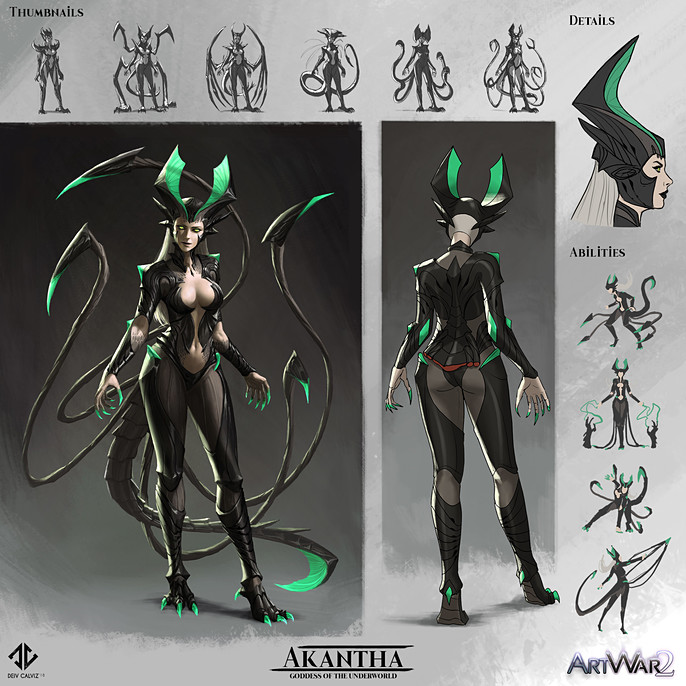
Illustration Sketch
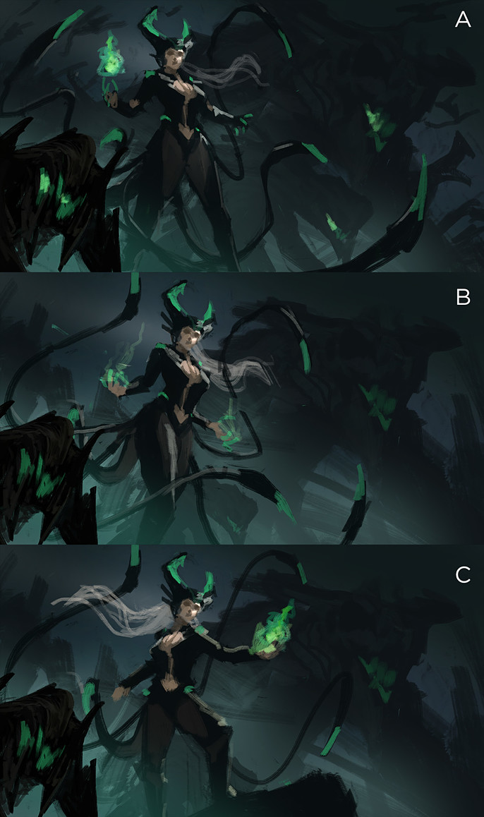
Now that the concept part is out of the way, I started the illustration by painting directly in color. I was slightly in a hurry to finish so I skipped the lineart part. I made sure that I added enough lighting detail for the silhouettes to stand out. I created three versions and let people decide which one looked more appealing. I eventually settled on the version which was more feminine. I thought it fits her personality better.
References
This was a tricky angle to paint so I had to find references to help me. I used two apps on my iPad to help with the lighting. The first app is called Handy which I used as reference for the face lighting.
The next app is called ArtPoseFE which helped me too figure out the camera angle and lighting on her body. I did not copy the 3D exactly because it is not accurate and doesn't look sexy.
I also took a few photos, downloaded Google images and other artist's works (mostly Ruanjia) to help me with the style and rendering.
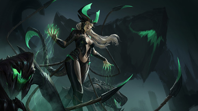
Character Render
Rendering the character first makes the rest of the image easier because it means that you can reduce the detailing on the rest of the painting because they are not as important.
I check the references again and again to have a consistent lighting. Imake certain that the magic effects are on a separate layer so that I can easily adjust it without destroying the painting below.
Foreground Monsters Render
Adding elements with different distances from the camera adds more depth. Since this illustration doesn’t have much of a visible environment and props, I used the dog creatures as elements to put in front and behind the character.
I also have a giant monster behind her that I rendered like a mountain with mostly silhouettes and subtle highlights.
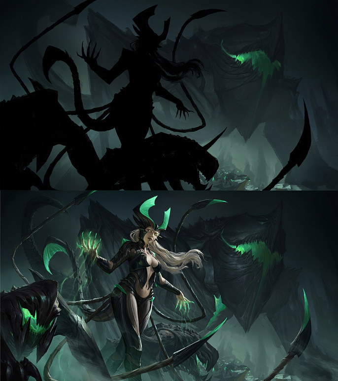
Background Render
I rendered the background last and made sure I maintained the established colors so that the balance of the image won’t change. I temporarily put on a solid black mask to cover the character. This helped me focus on just the background during this stage.
Fog
Once all the elements are rendered, my next step is to review the values. If the elements near the camera feel like they are merging with the background, the cheapest trick is to add more fog in between them using a soft round brush. This lightens the layer behind and emphasizes the silhouette of the element in front. This trick has been used to separate each element in this painting. The image below is just a simplified rendering of how each element's silhouette is still readable thanks to the fog layers.
Final touches
To finalize it all, I used a smudge and mixer brush tool that is set to “all layers”. I use these tools to blend in any digital looking edges to try to smooth things out. I also added a bit of tiny smoke effects for style and some color gradation and contrast adjustments. Make sure that your focal point is the one with the strongest contrast.
That summarizes my painting process. I hope you learned something from this one.
If you want to see more tutorials by me, feel free to visit my Cubebrush store.
Thanks for reading!