
The Journey to Bring ‘Thunderlord’ to Life
My name’s Philippe Sawyer-Beaulieu, I'm a Canadian-born, freelance illustrator and animator (and sometimes writer if it’s a slow day!), working in both classical hand-drawn media and 3D.
For a fair part of the last few years, when it came to illustration and comics, in particular, I’ve been mainly focused on the traditional methods and mediums for visual storytelling. Partly because I’ve always enjoyed the tactile sense of paper or canvas and how a pencil or brush reacts to its surface, but also as a means to slowly but surely improve my artistic skill sets through muscle memory and quick, on-the-fly practice.
When I learned about Art War V, I was a bit apprehensive about jumping right in because of my lack of more advanced digital painting experience, or at least that which didn’t pertain to filling in flats for cartoons or applying textures to 3D models.
Looking through past winners and competitors showed much of what I do lack, and my creative nerves were a bit shaky, to say the least. A great deal of what I know is based on traditional skills and techniques, such as quick pencil sketching for gesture and movement, rendering, and acrylic painting, some of which are shown in an example below.

But what better way to learn those tricks than to jump heedlessly into the deep end! So that’s what I did. Using Art War as an excuse to dive into a complex digital piece wasn’t just harrowing and confusing, it turned out to be a heck of a lot of fun!
Concept Development: Do Your Research!
When representing Canada in an Art War, I needed to think about our country’s history and culture first. But because we’re such a young nation, there’s ‘relatively’ little to pull from (that isn’t already steeped in stereotypes), in comparison to our cousins from across the pond with their thousands of years of historical background and lore.
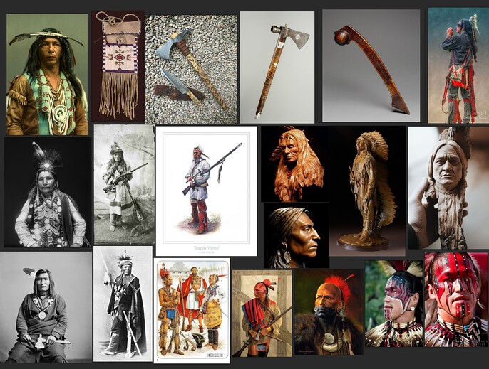
So I also looked towards those who had been here long before the first settlers landed on these shores, the First Nations of Canada. I took time to read through their histories, their cultures, spiritual roots, and ongoing struggles and stories.
I’d grown up learning about them in school, and was always fascinated by the various cultures and nations of the Algonquin, the Huron, the Iroquois, and the Ojibwa. I was able to speak at length with family who are involved with a Huron reserve near Quebec city. This helped to inform me of what is and isn’t appropriate to portray, how to avoid being inadvertently disrespectful towards specific peoples, and to avoid appropriating a culture that is not necessarily my own.
It also gave me a better understanding of how to tackle this project in the way I wanted, and to stay within the bounds of the contest’s rules. I was able to pull together some wonderful references, as shown below.
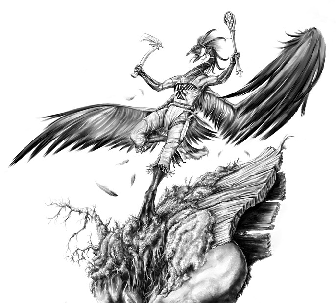
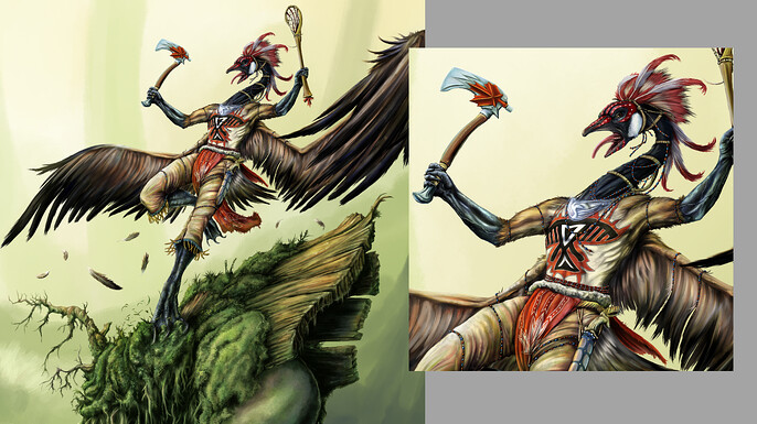
Now in this art competition, I needed to think of something to really amp up the ‘War’ in Art War. Something terrifying, unpredictable, yet iconically representative of ‘Canada’. Something wholly aggressive, on a quest for the destruction of all things, and the acquisition of shredded bread and discarded popcorn. And as someone who has been attacked not once, but three separate times by these unholy amalgamations of dinosaur and flying snake, I knew the Canada Goose would be perfect!

Thumbnail, Sketch: Choose Your Weapons!
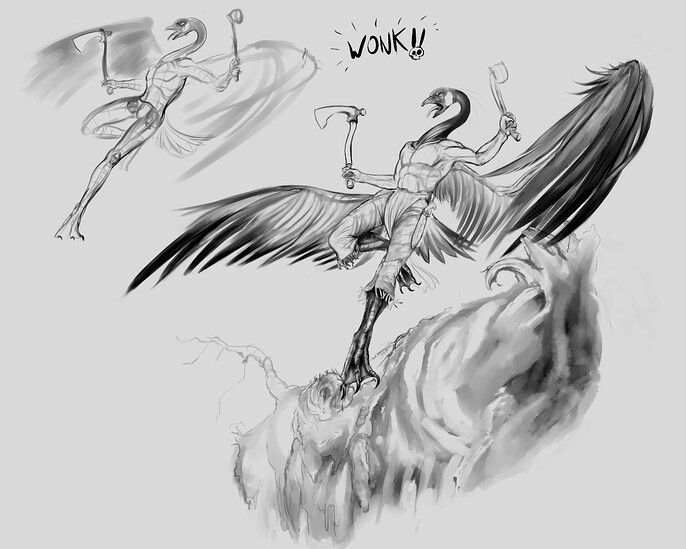
This is a stage I really love, no matter what I may be working on, simply because of how raw, unknowable and dirty it starts off. Thumbnailing possible poses, layouts and just getting everything goofy, sinister or unnecessary out on the canvas is a joy. And just playing around for hours like this can open up paths that may have otherwise remained hidden had I just started straight into a baseline sketch.
*For those of you wondering, I used Clip Studio Paint for the vast majority of this project. I really can’t recommend it enough.

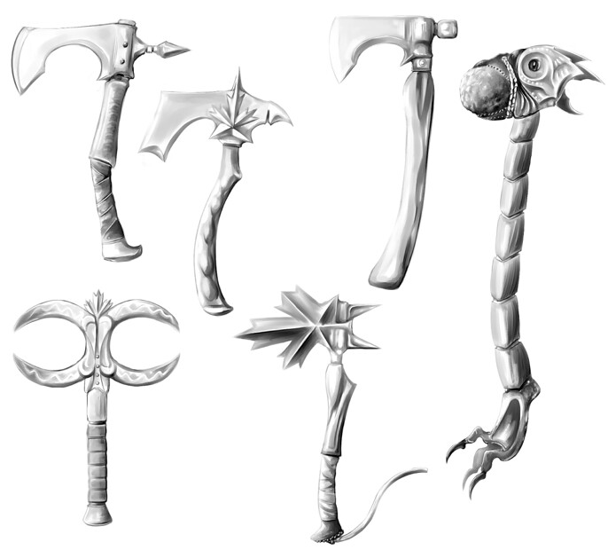
A few ideas for weapons, nothing was set in stone at this stage for accessories, though a hand ax of some kind was what I wanted to produce.
Eventually, I settled on one pose in particular. It wasn’t perfect, but I liked how the movement and energy allowed for a strong interaction with the characters surroundings while keeping the figure lithe and graceful and in full view. It made for a fairly recognizable and eye-catching silhouette, while avoiding as many tangents as possible that could lead to confusing the eye. I also tend to think of it in terms of, “Would this drawing make a good statue on my shelf?”
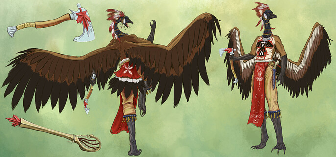
Since the Art War competition required a character sheet to coincide with the final illustration, I used this as a way to further develop any details that I need to ensure don’t get forgotten in the mess that would follow.
Rendering: Devil’s In the Details!
Now this part was fairly new to me since it was to be done all digital which I had never really tried to this degree. Normally I’d use blue Prismacolor Col-Erase pencils to build from soft to high contrast on paper and scan it in, but for this, I decided to try CSP’s watercolor brushes to lightly build up larger forms, and then bring into play the kneaded eraser tool to open up highlights and draw with negative space. This was followed by the smudge tool (running color on fiber to be exact) to mimic that messy pencil experience all while having that most glorious ‘Undo’ button available.
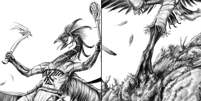
This is where most details were hammered out, and thought things could be tweaked and changed, I made sure to get the overall finished character design down to avoid confusion in the coloring stages, taking great care to ensure I got my references, clothing, and accessories accurate and meshing with the overall figure. I added a lacrosse stick to coincide with the ax, seeing as it’s the oldest organized sport in North America, and rather appropriate for the situation. Take it from me, it is a painful sport and worthy of a warrior in flight.
I was thrilled with the results, and though I still love to draw by hand, you can be sure I’ll be pursuing greyscale drawing in this way for a long time to come!
Map Out That Mess: Something I Learned!
This is the point where I started looking at various references to begin applying colors to the background with large textured brushes. This allowed me to feel my way through what looks and feels right in regards to the overall layout. Experimenting a bit with warm or cool colors can lead you to some interesting ideas with regards to what kind of environment your character exists within. In this case, I stuck to a forested area, similar to those ancient growth forests of British Columbia and the west coast. I kept it a bit on the warmer side to help bring out the colors that I’d apply later to the character’s gear.
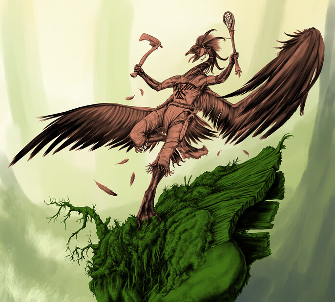
Now before mapping out flats, I created a ‘lighten’ layer over the grayscale image to lightly add a tint to the linework, giving a better sense of warmth or coolness to the drawing. This may not seem like a big step, but it influenced a great deal of the color choices and lighting later on in the process.
Those warm or cool colors work in tandem with the details added afterward, and it kept me from having to work with straight black line art. Then I mapped out flats to give me an idea of what base colors various items could potentially be, and to also make selecting and isolating these parts a breeze!
Happy Accidents: Colour Me Surprised!
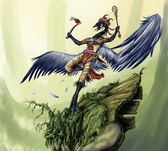
This was the point within my process where I began applying colors to flush out various details in the character, all the while keeping in mind what certain materials are made of and how the light plays across them. I was lucky enough to find some cheap, but excellent brush packs for CSP that mimic traditional painting in both acrylic and watercolor. I’ll use everything from heavily textured brushes that I can be blended back, to large soft brushes to mimic washes for subtle shading. It’s a lot of playing around to figure out what works for you!
Much of what I did early on is applied between a ‘multiply’ layer, and an ‘overlay’ layer below the grayscale image, which is itself set to either ‘Linear Light’ or ‘Multiply’, or whichever setting I found played best with the color schemes I was trying.
After bouncing between the two layers a bit and I was happy with the results, I’d combine them down with the flat that they were influencing. I would then create yet another pair of layers over this newly combined flat, in order to continue the process. Wash, rinse, panic, repeat. Was it confusing at first? You bet!
In many cases, combining layers like this may seem like a frightening proposal since what you just worked on is now ‘locked in’. But for me, this is where the “painting” aspect comes into play.
I think of it as a stretched cloth canvas, where there are no selectable layers, and no ‘undo’ button. There’s no going back, but you can always apply more paint over top, or blend things together! This can help to reduce later confusion by reducing the overall number of layers being worked on.
Through this process, I continued adding in details such as the warpaint, symbols, beads, and other little details. This is what would all come together, in the end, to define the character as the fierce warrior they are. I also made certain that I added in the appropriate drop shadows on the moss and log, helping to ‘connect’ the character to the ground, and therefore the environment around them.

The Final Stretch: Background and Polishing!
I began picking away at the background to help give it some more life and detail. Since the competition was about showcasing the character design, I was not terribly concerned about creating a hyper-realistic landscape.
I always admire a really well-painted background, but doing so can potentially risk the character becoming lost in the details and harder to make out, a balance between the two is what I like to aim for!
As the character’s design came together and I took time to cry in the corner, I turned my attention to creating some layers for atmospheric effects and to fine-tune the lighting and temperature using correction layers. Some may find this easier in software like Photoshop, which tends to have more tools for fine-tuning colors and layer effects. A bit of sunshine, floating pollen, splats, and blots to indicate insects, that sort of thing. All going into creating a sense of ‘life’ around this figure. I also cropped some of the pieces in order to better focus on the character and the details therein.

Once I applied the logo, combined my layers, and saved it off in a web-safe format, I breathed a sigh of relief, scratched my head in confusion, and asked myself, “How the heck did I do all of this?”
Final Thoughts: Keep On Trucking!
As artists, it pays to keep in mind the journey in which we’re all taking part. Some are just starting out on a designated path, other’s are far ahead in the unknowable distance. And some of us are still slogging through the swamp, or lost in a forest, or stuck head-first in a crevasse waiting to be pulled out again. Just know that none of us are alone in this process.
I hope that you, who are reading this, have been able to take something away to help with your own journey.
Be kind to yourselves, be kind to each other, and keep creating!
Canadian Thunderlord
See more of Phil's work here: