2D Art War 4 Finalist: Chum and T.H.Waters
Alex Heath is a freelance illustrator working in the video game industry. He's worked on many games, most recently on Riot Games for the Legends of Runeterra CCG and Wizards of the Coast and Niantic inc on Valours Reach.
Here, he gives us overview of the process used to make his Art War 4 entry "CHUM and Theo Waters"
Stage 1: Designing the Character
Starting out I knew I wanted my character to be a shark, have a companion and obviously fight for the water faction. With this idea as a base, I did some very rough character sketches.
Early on, the companion was a goldfish, I wanted to have a contrast in the characters. The smaller more intelligent companion and the smash everything first and never ask questions brute shark. I liked this kind of whimsical pairing and thought the contrast would be a funny and interesting element to play with later.
I tried many designs around this theme, I found the different poses helped me to see the personalities and offered different design directions.
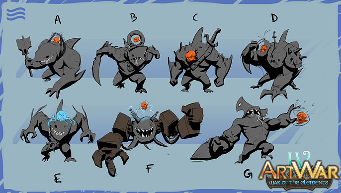
After the initial designs, I picked 3 that I liked and explored some iterations, working from the base design and adding some features like weapons, armour pieces and thinking about the characters.
I really liked the idea of having the companion be a an octopus rather than a goldfish. The octopus seemed like a good choice because they are very intelligent and can be posed to be very expressive in an illustration, something I thought would be great later on.

Having decided on the octopus companion I took 2 designs to push a bit further enabling me to explore the materials and costumes a bit more, flesh out the idea a little, and see it more resolved.
This next level of detail is needed for me to visualize the character in an illustration. I was torn between the 2 designs at this stage, the hammerhead was more unique but I am a real fan of Great Whites, coupled with the fact that he was a pirate I really couldn't say no to picking this one, I would have regretted it!

Stage 2: Thumbnailing the Illustration
While working on the design I was thinking about how to present these characters in an illustration. It's very important for me to establish a narrative for this as I find having a narrative and knowing the characters personalities helps me to design a composition that really tells a story and shows the characters in their element.
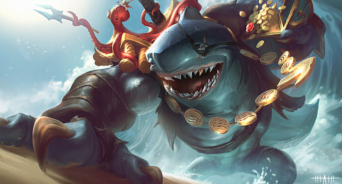
The octopus (Theo Waters) is a clever, artifact/treasure obsessed wimp of a character. He likes history and artifacts/treasures and has an eye for riches, however, he cant acquire these treasures himself, he needs some muscle. This is where CHUM comes in. CHUM (the shark) is a brute, a pirate, extremely violent and is all about the bling! Together the 2 are CHUM and Theo Waters. Theo has heard the other factions have some treasures and artifacts he would love to get his tentacles on, CHUM heard something about gold and started his rampage. We join the duo in this illustration, emerging from the ocean ready for battle. Theo is worried his companion might be a little more than he can handle and that he might have partnered with the wrong shark. CHUM probably hasn't listened to a word Theo has said and is ready to smash everything between him and riches.
I chose to show the contrast in size of the characters but having CHUM be the focus, hulking his huge body all the way from the foreground to the background, a huge arch of muscle and teeth that takes up the whole image. Theo takes a backseat, perching on his violent transport, looking on in worry.
This way of composing characters to show off their personalities is very important for narrative, a picture can replace a 1000 words but that image needs to tell that story and the composition is the key to that. This is why a backstory, character personalities and planning is important!

Stage 3: Color Rough
I take the thumbnail to color here. I use my design for the basics of the coloring. I wanted a nice hot sunshine so in the image could be very bright and fun, a whimsical feel and some humor too. I have a fairly good sense of color from doing lots of studies. It's a fairly intuitive process for me now but I would recommend making a mood board and finding some paintings by other artists that you really like the palette of and emulating it. The more you do, the more you will get a feel for what works.
The color rough is a useful stage for me, lets me see at a glance what the image is going to look like finished, it's the groundwork for the render and so I take a good amount of time to get the palette nice and rich.
When I turn a b/w image to color I use layer modes like overlay/color and multiply. However, this is not where the process should stop, these layer modes by themselves tend to look very washed out, values are shifted and its easy to end up with a very muddy palette.
Remember, muddy colors are either one of two things, the wrong value or the wrong temperature, and this happens a lot with just layer modes.
The solution: paint into your image on normal layers, use opaque color and enrich the palette with modes like color dodge. This stage represents a good hour or so of painting into the thumbnail.
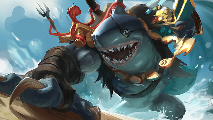
Stage 4: Render
Everything is set now, we have the composition, we have the color palette, its now time to render the image up to final and make its really juicy!!
Start the render and remember to go from general to specific, don't start with details! Instead, begin with larger forms, large shapes, broad strokes and experiment with warp tools to fix the poses and try to find a more exciting dynamic.
This stage can feel a bit like the image is not progressing but stick with it, stay focused, use reference and take regular breaks to refresh your eyes. Even 5 mins away from the image can help you see where mistakes are. Get some good music on, make a cuppa tea and enjoy the ride.

When it comes to detailing, I like to work outwards from my focal points, this means I don't over detail areas of less importance. After all, the focus here is the characters and their interaction with each other.
At this stage I push the material expression, basically making metal feel like metal, leather like leather etc, Use references, look at other painters and how they do it, emulate what you like and find your way of doing it.
Specularity is key here, don't make everything shiny! I pay particular attention to making the necklace read well and keep the movement of the sketch too.
Lots of breaks, lots of flipping the image and lots of cups of tea help push through this stage.

Stage 5: Post Processing
The render is done, but the image needs pulling together and given a final polish.
- I use a lighten layer to homogenize my dark values, saving my most punchy dark's for my focal areas.
- I go around the image and paint in some sunlight bloom, trying to get the heat of the day to come through.
- I use color dodge to push the sub-surface scattering of the tentacles.
- I use sharpen layers on the metals to pull out the texture.
- Finally, I use a combination of lens blur and noise to lose a bit of detail in the very foreground and the background, pulling the focus more towards the focal points.
Finished!
