
Digital Painting Tutorial: The Making of Amanith City
Deiv Calviz shows us his approach to creating an environment for the Worlds Challenge.
From detailed thumbnails to the use of brushes to detailed lighting, he leaves nothing out in this step-by-step process.
Intro
Hi, I'm David or better known as Deiv Calviz.
I used to work for a local game outsourcing company involved in games such as The Last of Us, Sims 4, Dance Central 3 and many other titles. Currently, I am now a full time freelance artist doing illustrations and concept work for various international clients.
In this article, I will try to breakdown my process and give you a glimpse my approach in making this piece for the WORLDS CHALLENGE Contest.
Thumbnails
Creating quick small thumbnails helps a lot in panning out your ideas without worrying about quality. In this challenge, I wanted to create an epic fantasy scene but I had no idea what to do so I ended up making 16 random thumbnails.
I recommend keeping the values at a minimum so that you can focus on silhouettes. I intentionally changed the shapes from squares to round and mixed them up with each other. Another thing to keep in mind is the composition. Try to place important elements using the rule of thirds method. Just keep it very rough to maintain the spontaneity. 
Brush
I recently discovered that using a horizontal or vertical flat brush makes it easier to do environment thumbnails because it gives an illusion of perspective without effort. The sketches to the right just took around a minute.

Developing the Thumbnail
I enjoyed thumbnails 7 and 13. I used the composition of 13 while keeping the rounded top buildings from 7. At this point I can imagine a market place on a weird planet with huge arches and flying ships.

Inspiration and Reference
Now, I need to decide what types of elements I would fit inside. My inspirations range from real references like medieval towns, middle eastern towns, or existing artworks from Final Fantasy 9, Moebius, Craig Mullins, Khang Le, and various artist's works. I try to channel what I like and combine them into this image.

Color Sketch
At first, I was confident I could go straight to a color sketch. For the sky, I wanted something more green than usual just to be slightly weird. The opposite of green is red so I thought it would be great if I could incorporate reds to the structures. I made the structures more white and neutral so they are not too distracting. On the ground, I want it to look like a busy market with a few weird creatures.
In this stage it is very important to decide what type of lighting to use and where the shadows would be. Having one side of the market in shadow while another in light, helps create more of a cinematic feel.

Fixing Perspective
Even if I had a decent color sketch, I realized that I needed a better sketch to figure out the perspective, overlaps, and composition before committing to the details. I have a one point perspective brush to stamp in the perspective lines. Next, I created a rough line layout of the buildings and elements as a guide in the painting process.

Painting Process
Usually, I would use basic 3D block mesh for more accurate perspective. However, I think that 3D block meshes tend to become a bit stiff because it makes me hesitant to change major elements of the render.
In this image, I will try my best to be more spontaneous and confident by developing it manually through painting with minimal layering. This means I did not separate the sky, the ships, and buildings, etc. I treated everything like one organic entity. This enabled me to experiment more and find happy accidents.
I only add layers on top if I am not sure of the changes. This is how a layer would look like if I isolate it. As you can see, I use a combination of soft edged brushes for the sky and a painterly edge brushes for everything else. Then, I can just merge it down when I am happy with this round of progress.

Rendering: Sky, Arches and Ships
I divided the image into three segments so I will not go crazy with what to do first. I try to vary the brushes I use but I go mostly for rough painterly brushes. To blend them you just layer in between colors until it gets smooth.
I focused first on the sky, arches and distant structures. This is the most important area since it has the castle which is the focal area. The colors here will dictate what the rest would be.

Rendering: Buildings
I let the colors evolve and bounce on each other. I do not use pure whites, or grays and I do not use hard strokes to let the original colors show through. The buildings are a bit inspired by the red mushroom called Amanita Muscaria which is where I got the idea for the name of the city.
Rendering: Market
Even if the market is colorful, I make sure there are no colors that appear too distracting. I want it to look busy so there should be enough variety of shapes and people.
Ambient Light
Keep note also that there is a green/blue-ish ambient light from the sky that will still light up shadowed areas facing the sky. This is very subtle but important.
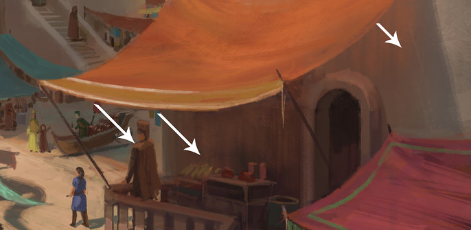
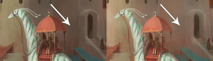
Subsurface Scattering Light Source
For other areas under tents. The subsurface scattering will make the light pass through the tent and light up the area below with the color of the tent's fabric. This is a minor lighting note but will make it look more realistic.
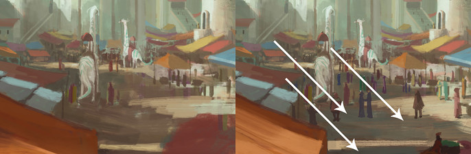
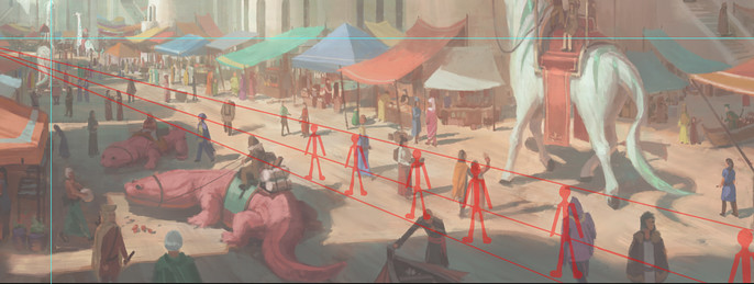
Perspective of the People
To do the perspective of the people, I use a simple guide based on the horizon line to indicate how big a person should be. I align the people to the guideline based on where they are standing to know their possible height. Make sure not to make everyone the same height though. To check if I did it correctly, I can easily slide this guide from left to right and align the people to it.
Finalization
I take a day off from a painting if possible before finalizing it. This is so I can look at it from a fresh perspective.
During this stage, it is all about adjusting any stray colors, or distracting values, while keeping the focal point in mind. I used a huge soft brush to add fog or to darken any distracting areas like lightening up the area behind the tall so there is less contrast on that area.
Finally, Adjustment layers like curves or levels are great to punch up the contrast. I also used a bit of selective color and hue saturation to liven up the blues and reds.
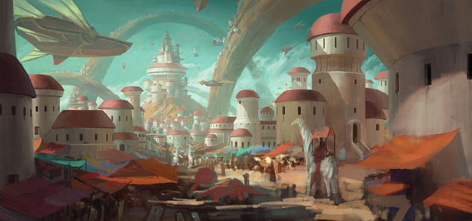
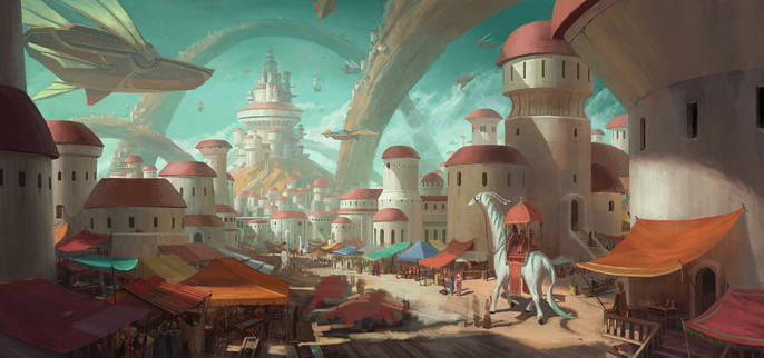
Here is the final image.

Conclusion
I learned a lot from this image. I realized that it was possible to do a complex scene without using any 3D. All I needed was to believe in my skills and have a basic knowledge of perspective, color, and composition. I am happy with how it turned out despite it being a bit more fuzzy and brushy than my usual stuff.
I hope you learned something from this short tutorial.
If you want to see more tutorials, feel free to visit my Cubebrush store.
Thanks for reading!